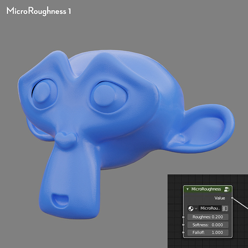
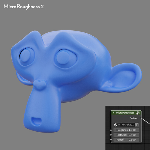
I don’t know the answer, but here are some test renders with the various settings, as well as the unchanged principled BSDF shader roughness.
You have to observe the real materials and deduct yourself, although a metalliz suzanne with a well reflected hdr would have been easier to analyze. We have a diffuse material at work where the microroughness effect doesn’t really kick in until 85° or so and then become smooth reflections, whereas my own apartment floor has a much more gradual smoothing towards grazing angle.
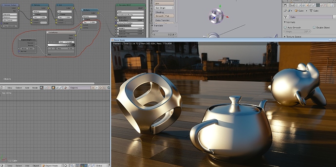
Here is how I approach it. To me this is faster to match what I observe, although microroughness isn’t typically what I bother with in my own renders. Both the metal and the floor has the same microroughness parameters, although the floor has a “proper” roughness map.
If you want to discuss reality, don’t forget about diffuse roughness and anisotropic shading. If you have no value given, diffuse roughness can to some extent be derived from how absorbent a material is (how much water it can hold before it is fully saturated). Anisotropic shading can be an absolute nightmare. Most tutorials about the matter messes it up. Any kind of material that flexes, stretches, or deform in some way should have it. Even for simple things like (not super) polished metal (where reflections are very sharp but still bright lights will streak around like crazy) is not trivial to setup, and that’s for shading alone. Controlling direction to match machining, oh don’t even get me started how painful that is (in any software I’ve tried).
Wow… i’m always late to the party ![]() …too much to go through it all
…too much to go through it all ![]() … so I’ll just make it short - what are we all dealing with?
… so I’ll just make it short - what are we all dealing with?
Light!
That’s all.
…
Example i posted was to show just that (intentionally left all the textures out).
Used only 3 area lights, HDRI-IBL & a pinch of real camera “imperfections”.
Asset is from the library. (Did create a huge collection in 15 years.)
Now it takes 15 minutes of, rather more contemplation than work & 3min to render @ QHD.
Nice observation BTW, shows your interest & a common human flaw - looking for a winning solution by looking at competition, their faults, which are all the wrong places ![]() It’s a modern consumer strategy, same as propaganda is, just to confuse a striving mind and control, exploit its force much easier. But as I have learned – where there’s nothing wrong, there’s a ton of material to learn from!
It’s a modern consumer strategy, same as propaganda is, just to confuse a striving mind and control, exploit its force much easier. But as I have learned – where there’s nothing wrong, there’s a ton of material to learn from!
Considering ‘panta rhei’ (everything flows, everything is in motion), the process of true evolution is only possible in a stable environment.
Thus, look at what makes the image strong VS what it makes it weak within human perception. Observe your inner self, your primary functions, the first 15 minutes after impact by “something of interest” is the crucial ‘co/inception’ time.
Sooner or later, what is left to contemplate or meander over - is…
… optimization of all & everything that’s been before there was nothing.
Word.
Hawking, don’t be mad, ‘word’ Is just a word that was used for parallel, because we know “nothing” and we have no other ‘word’ to express “what it” IS. Also ‘word’ in material sense is ‘nothing’. (To prove you right.)
…and then, there was light!
WTF… uhhmmph ![]() hehehehe…
hehehehe… ![]()
A small dive back into post-processing.
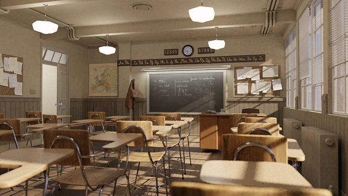
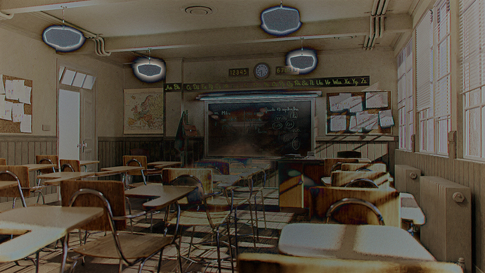
I’ve done a little post-processing test/demo with the Classroom benchmark.
It has:
Glare: Ghosts
Glare: Bloom
Chromatic Aberration
Vignette
With a the post-processing.
The raw render.
One more image to clarify the effects of the post-processing:
The (normalized) difference between the post-processed and raw images.
The first thing that jumps out at me is the raw saturation of the scene, (not negating anything anyone else has said) but I would spend some time looking at photos though your seperate hsv filters, just to get a feel for how they look under those settings.
here is the scene through a saturation filter and those whites need taken down a little.
A lot of good tips in the thread. Here is another general tip I haven’t seen mentioned yet; Treat the scene camera like a real physical camera in a real physical place.
Pick a camera and set the sensor size accordingly.
With that done, determine the focal length needed to get the shot in frame. In 3D, you can cheat and make the room fit your desired focal length, but a photographer might have no choice but to shoot at, say 5mm.
Next, set up depth of field with an appropriate f-stop. You might not be going for an obvious effect here, but even with a deep focal plane, camera optics are not perfect. With a focal length of 5mm and an f-stop of say 2.8, you still may get some sub-pixel blurring at the edges of the focal plane.
It’s suble stuff like the camera abberations mentioned previously, but it all adds up.
Thanks, this is helpful. I hadn’t realized how far I’d pushed that.
Thanks for the input! A lot of what I’m seeing is little stuff. I think you hit the nail on the head:
“It’s subtle stuff… but it all adds up.”
To get realism:
- Use ref images. Not just “ohh. a picture of a bed”, but get images that are very, very close to every detail of that bed. How does the surface look up close, the structure, the pattern, the reflection…
- Bevel, Bevel, Bevel…you have way to sharp edges on your images. Need to make them rounder.
- Imperfections… but not too much. I have seen these hordes of pictures that comes out from Substance Designer/Painter…and many of them overuse the tool. Small imperfections are more effective then big ones.
- Fresnel. Use the principled Shader where you can… but that shader still has limitations. You need to beware of things that need Subsurface scattering and/or are more or less transparanet. There you might need to work with other shaders as well.
- Correct Light. Very important! Not just hit the image with an HDRI and think all is ok. You need that one for sure, but you also need a lot more to make it work most of the times.
- Dust… not just imperfections, but dust is always present in small or larger quantities.
…and start practice on small things… like a vase, a dice, a cup of coffee to find the real realistic feeling.
Well, that’s a start for you. Hope it helps.
Nice! Thanks for sharing. I never understood why the specular control was implemented the way it was, when the P.BSDF was billed as a PBR friendly solution.
Before now, I was content just eyeballing it, but I prefer to get physical. 
Great reminders on a few things, but Especially your thoughts on the Principled shader, thank you! Since this addition I think it’s been a bit of a novelty for me. I love working with it, and it’s no doubt sped up my workflow. Good reminder though that sometimes other techniques are needed, especially when it’s made evident in the striving to re-create something from reference.
Also, I 100% agree with your thoughts on “imperfections… but not too much.” I think I had become so frustrated with the over-use of that “grunginess” in our industry that I’d accidentally written it off entirely. I’m starting to see that as with most things, less is more, but less is also more than not at all. It’s a fine balance we walk. Thanks for the great reminders! Simple, but most important for taking things to the next stage.
There are a lot of great tips here, some of which are beyond me. I have one small tip which seems to have been overlooked: placement. I’ve made a lot of beds in my life, and never have I gotten the end of a bed runner perfectly aligned with the edge of the blanket (second image.) Those pillows under the bed in the first image are also quite pristine. Their edges are perfectly straight, with not one lump, bump, or wrinkle. Real life is messy, and not just because of dust and fingerprints. It’s hasty. Try to place objects as though you were on your way to answer the phone when you set them down.
Beautiful work though. I quite enjoy your style choices around exposure.
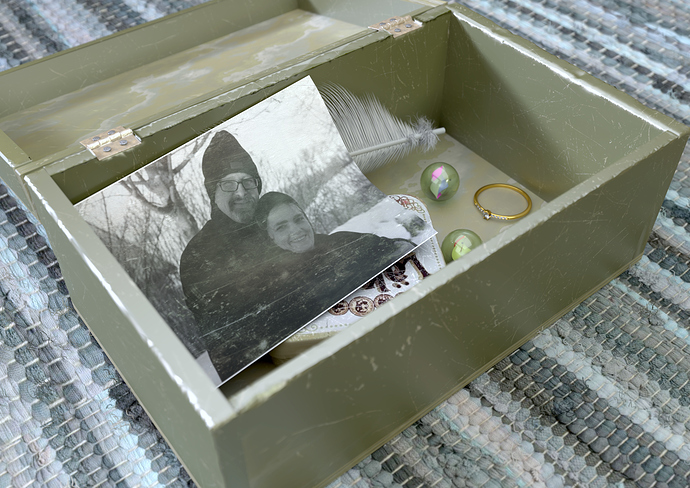
One other thing with realistic scenes is that they can get boring if we aim at 100% total realism. Using 3D… or do post processing of a photo… is to enhance what is real. Sometimes we must play with the light and do things that is “not” realistic to get the “correct” feeling. I did this render a few years ago as a “close to realistic” practice. I think I succeeded rather well, but I also think that to get the interest up on this romantic “memory box” I should have thrived harder to get a romantic light and feeling…even if it should be very subtle so that an ordinary viewer still thinks its a photo. In your world of architecture images, you will not want 100% real images. They should be brighter, cleaner and more tidy than it would have been if taking a real photo…but so close to reality that people think that it is a photo.
Learn to manipulate “edges” both in your models and in your pixels.
You can also learn more from by not looking into photos but by looking into master painters.
Apologies for the confusion - this is actually the correct one, not the one I posted earlier.
The two node groups produce a similar result and are based on the same principle - but this one is more intuitive as the “softness” relates directly to the glancing angle roughness - as opposed to the other node group in which it was modified by a 0.1 multiplication factor.
Honestly, this is some of the best advice on this topic so far IMO. My work has always been a balance of technical ability and artistic liberty. I think what you’ve described is a fantastic balance. I’ve been caught in that trap from time to time, striving for realism and realism alone, when “cheating” the image a bit with that freedom is really what is needed to keep things fresh and alive. Thanks!
Yep, that’s NODES better! Thanks.
One thing to remember is: “there’s really no such thing as ‘photo-realistic.’” What you’re really saying is, “like a [professional] photo,” and that’s not “realistic.” A photo is very carefully contrived to work within the limits of film or digital – as your CG must work within the limits of video. Then, the photo was “post-processed” in a chemical or digital darkroom, and further “pre-flighted” before print.
I can instantly-identify a typical Cycles render because the lighting is uniformly flat and uninteresting, and because the tonality seems washed-out. Of course, “smooth and perfect lighting even in shadows” is what these algorithms are supposed to do, since they trace from an illuminated point to a source of illumination not the other way around. But the result is not at all what a photographer would do – or, could do.
I’ve referred to Ansel Adams and his Zone System, and I’ll refer to it again now. He condensed a very complex technical subject concerning film (but also applicable to video) into simple numbered “Zones.” Today we can do even more with the histogram tool. Although we can represent “whiter than white” or “blacker than black” in our digital intermediate files, when we actually view or print them we must operate within tiny technical limits.
Everything in a well-made photo is about contrast: color, saturation, and tonal range. Media han extremely limited ability to capture imagery compared to the human eye because the eye scans the scene to assemble our impression of it in the marvelous visual cortex of our amazing brain. We must capture (or in this case, contrive) a contrast of neighboring light-values within the very narrow limits of our media that effectively approximates this effect when viewed on-screen.
