Why mono colored icons for blender 2.8?

Logos and icons are constructed and designed in the same way, they also perform the same communication, they simply represent different things. Icons typically represent an action or specific item, where logos are required to do more, specifically they are supposed to emit an emotion and capture a brands identity (meaning they represent more abstract communications). You are suggesting the design rules dont apply because they dont represent the same subject matter, and that is flat out incorrect.

When an icon can have its colour changed, you can customize it to work with any theme, you are the master of the colour - unless you decide to pick colours of the same value, which would just be silly and the error would be on you, not the icon. Again, another blanket statement that simply isnt true.

Outlines are also a terrible way to work in any form of icons/graphics, if you rely on an additional line to separate your graphic from its background, it is just another layer of complication and falls apart when viewing it at a small scale. Icons and logos should be judged by how readable they are in their most basic form and at the smallest of scales. Think about the nike swoosh or a wifi symbol. The same is true for both.

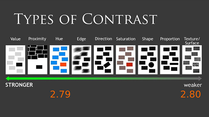
We identify flat colours and illustrations just fine. That is why the universal illustration style for any public signage is flat. That is universal world wide, by private companies and governments alike. Like bathroom signs, road signs, medical symbols. etc. There is mountains and decades, and millions of dollars, of research on this.

Nothing I have said has personal prejudice, this is basic design knowledge anyone should learn going to any basic college level design school, while everything you have said seemingly does.

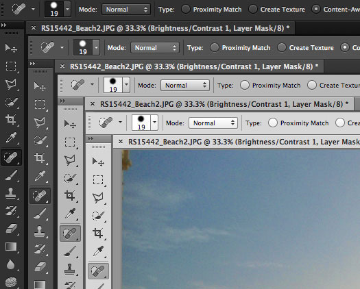
Also, show me where this so called emboss is? I also dont see these outlines on icons either. The only “colour” are 3 instances of monochromatic shading (which I think the only icon that this helps with is the gradient, all of the others dont seem to do anything). Might I also add that photoshop only offers 4 “themes” - an extremely dark grey theme, a fairly dark grey theme, a fairly light grey theme, and an extremely light grey theme. All of which are monochromatic and rely on the two polar opposite ends of the spectrum (there isnt one that is in the middle value of grey). This is because the icons are themed with two colour options, knockout white or black.

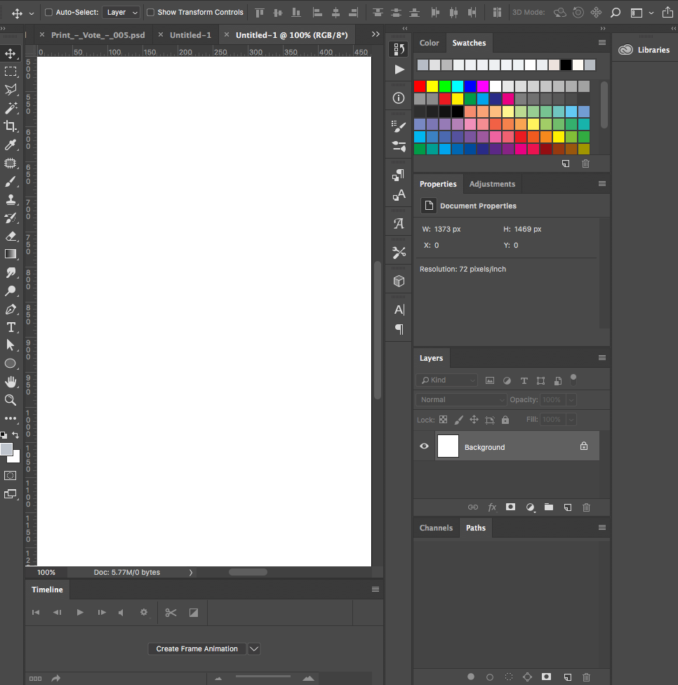
2.8’s layout is barely more complex than this as well. Lastly, photoshop is probably one of the least complex layouts in the suite, remember I also mentioned the other adobe applications - look at after effects for example. Again, I dont see what you are talking about.

I feel like you are trying to obfuscate your opinion (which is what it is), by saying “highly adopted =/= good”. I can flip that the same way and it doenst mean anything either, “seldomly adopted =/=good”.

1 Like

Logos are usually designed to be visible at high dpi regardless of size. And the base size for designing will be larger, even though being recognisable at low sizes is a concern, it’s not the prime focus. Logos are also strategically placed most of the time, with ample negative space and if needed their own backdrop colour.
Icons have a set size they need to be recognised at, and they exist in a much more cluttered environment a large portion of the time, often on unpredictable backgrounds.
They’re designed for different purposes, the design rules therefore will differ.

Sure you can design an icon colour that works with any theme, in that it is contrasted. But for lighter themes, that colour is going to almost always be black, or something so close to black you mayaswell not bother giving it any saturation. Customisation in theme colour picking here is lost, not gained. And, icons now have a harder time being different colours from eachother on the same background.

Outlines work. They separate the icon from the background under almost any conditions. In such a small space, this is even more crucial and hard to attain. The outline also enables the icon to be almost any colour, unlike without. You don’t rely on an outline, you leverage it, as a tool of design. Go ahead and make 200+ icons that are 14px by 14px stand apart by shape alone while being forced to use only one colour and no shading, and placing the icons on a variety of background colours, reasonably tightly packed. It’s absurd, it turns into a sea of white hieroglyphs.

We understand flat shapes fine. We automatically, and immediately interpret 3d shapes and objects because we’re wired to identify 3d shapes in the real world, it’s how we work, our spatial awareness. Otherwise, someone like me with a lazy eye, would suffer horrid depth perception and spatial recognition issues because I couldn’t recognise the 3d shape of my surroundings from mostly shade. 2d shapes are largely of our own design, they’re glyphs, symbols, we have to take a moment and interpret them far more than the immediacy of recognising 3d shapes. Shading merely leverages that. What’s more immediately identifiable as a cube? the 9 or 12 line wireframe, or a shaded icon?. Try and make a sphere icon that’s 1 colour and shade, and can be recognised as a sphere faster than a shaded icon.

Signs are big, and have their own assigned negative space - these two things beat anything. They also don’t typically convey ideas that are easily converted into spatial objects, and roads are flat.

I didn’t mean to say you were conveying prejudice. I meant to say everyone who continually insists that people who have an issue with the new icons are merely upset because of change are assuming their arguments (such as mine) are prejudiced as such, when they aren’t.

Basic design knowledge, like this which 1D_Inc posted a while ago in the discussions?
image

Hmm, I was referring to a screenshot from the other thread, perhaps photoshop updated.
image
Though I would point out even the photoshop icons are not beholden 100% to this ideal. The cube on the right has an outline, why?, because it helps. And who is to say this is a positive change anyway?
Blender is not photoshop, perhaps photoshop could have benefited from coloured icons aswell, but we wouldn’t know, you can’t be sure any change made to commercial software is done to make it better or easier to use, you can only be sure it’s made to help it sell, or because someone thought it would help it sell.

Blender has coloured icons, in the outliner at the very least, so it’s an issue it has to deal with either way. Photoshop’s solution of light themes by making everything black isn’t going to cut it.

You made the statement that photoshop, and other “highly adopted” software, are examples of why mono ui is “completely fine”. I was saying that’s not inherently true, you can not draw the conclusion that because a software is highly adopted, it’s ui design practice is free from issue. Saying now that seldomly adopted software is also not automatically good does not negate this. Also just because you have learnt by muscle memory the ability to quickly use photoshop does not mean that would not have been easier or faster had some of the icons been more recognisable at a glance via the use of colour. You might even work faster because you’re not relying on muscle memory alone, but muscle memory combined with extra visual aid.

1 Like

was about to bring this one from the other thread

Color isn’t much of a problem, but these “mono/material” icons limit the ammount of information (specially the illusion of DEPTH) by using too few shades of gray. And sometimes a 2d outline isn’t enough to fully communicate the idea. Also, the shades could be translated to different colors (as alphas, maybe?) without breaking uniformity

file-20170829-5012-mu9wnk

2 Likes

the image association could be interpreted in multiple ways

yes, this was more or less the purpose …
what are the possible interpretations that emerge?

anyway we are without any doubt in this situation :joy:

I’m personally not a fan of the mono icons. That goes for other software as well.
I understand that themeing will be possible, but changing the color of ALL the icons doesn’t solve the issue of variation AMONG icons.

The problem is, It’s the latest trend as they look really nice, slick, fresh, exciting…
…Until the freshness wears off and it’s back to being a tool to get serious work done.

At that point, I don’t care how cool it looks, I want it to be as efficient for my eyes to find information as possible. That especially goes for when I’m in crunch time, and I’ve been staring at the screen for the last 10 hours. At that point, a bunch of really tiny, mono-chrome icons just blend together.

I have that problem with other software that follows this trend, and every time I end up switching to a colored icon set if possible. Does it look as nice? No. Is it more productive? Hell yes!
With varied colors, it helps to break up the icon stack. When my eyes are fatigued from a long day of work, I know that the tool I’m looking for is one down from that blue shape, for example.

I’d also like to point out that this is why pianos use both shape AND color to break up the pattern.

7 Likes

Making matters worse is that the icons now go vertical (Which I do actually like), but there is no familiarity anymore. If we’re going to go vertical and throw everyone off on where to find stuff, (again, I like the vertical), then the color should be kept at least for now to give us all time to adjust to the new layout.

here is how i see it, ask developers to write code with just black and white and no highlighted text and see if they like it, they’ll go crazy if they are forced to use it…they shouldn’t put Artists in the same situation either.

8 Likes

I red of all your replies,

I can only think of 2 things,
People wont be able to discriminate objects by a very powerfull attribute “color”.
And because of this, its harder to learn the current GUI, to memorize it.
The later was a major design goal for 2.8, to make it more easy to learn Blender.

The Gui now looks like single colored m&m (candy) all over.
As icons are candy by definition.
Minimalizing “was” a website design trend for a while (a year ago).
But websites dont offer such a rich choise in their user interface as Blender does.
So i can only conclude it was a wrong decision

I hope it can still be altered, to allow for multi colored icons.

2 Likes

In a way the crux of it is this:

jendrzych was working on his own icon set, based on his own principles and rules.

One (or more) developers liked the look of them (for whatever reason), and decided to add them to blender.

New icons were added. Icons in the sheet were moved, with no regard for compatibility with the old icon sheet.

Devs now don’t want to take the time to make the old icon sheet work anymore.

So it doesn’t really matter how stupid of a decision it was, or how poorly it was executed - the changes were made destructively and the dev’s don’t want to spend the time fixing the old sheet.

Conjecture: I can only assume minimal if any development time was allocated to icons in the first place, and the new icons were changed simply because someone liked the look of them, and it took next to no effort on the devs part. So now, whether or not they’ll admit it was a mistake, they have a massive bias to justify them, given that resources and time that weren’t allocated would have to be wasted were they to undo the changes. Sunken cost fallacy.

5 Likes

Well not all devs like them either, it still amazes me it got in.
Maybe more afraid that this becomes a hot topic they left it as loosing more time to it.
But since blender is opensource i hope they kept in the options to deal with multicolored icons.
I’ve not seen the cource code for it, but i hope these maps can be altered still.

1 Like

To be fair, the original icons weren’t made by the core developers, either… they were also made by @jendrzych in his free time. Anyone here could take up the task of updating the old icon sheet in their free time. If you want there to be another option, make one. It’s a big task, but there’s at least one person who’s done it (twice).

Things get done in the community because people do them, not because people request them to happen.

7 Likes

You are more than welcome to jump on board and create your own colored version of the new icon svg and export a colored png to compile with Blender - this is actually something I want to do AFTER they finish the UI and accommodate all the new icons needed. William and Jendrzych worked on 2.5 and now on 2.8, and I do think that it seems to go unappreciated here. I think that it has already been said that the old icon sheet was insufficient for 2.8’s needs, so the work has to be done no matter what.

4 Likes

Amen and amen. Nike, just do it.

2 Likes

I hate to give the classic Open source reply to this but:

If you don’t like it, make a better one.

The icons are in blender because @jendrzych took the time to do it. User customizable icon sheets are in the works because @BTolputt is working on it.

I imagine BTolputt would probably have an easier time if someone were to prepare an updated 2.7 style icon sheet that matches the current 2.8 one, so that he has an alternate icon sheet to test with.

There have been tens of thousands of words written about how terrible the new icons are, and I have only seen a handful of mockups about how to improve them. IF you have enough time to write reply after reply after reply, then you’ve definitely got the time to fire up inkscape and get to work.

3 Likes

You know I’d be perfectly happy if they came out and said “We don’t have the development time to fix this, but yes, the new icons are a step backwards”

But they don’t.

So?
Are they free from criticism and perfect in every way just because someone made them in their free time?
Even if I made another option, we can’t switch icon sets without recompiling blender. Meaning it would be Entirely pointless because the devs won’t admit to, or don’t see a problem with these mono icons.

I don’t personally appreciate their rigidity and firm non-acceptance of any evidence that suggests mono-icons suck, no.

I can appreciate that they’ve done a lot of work. Doesn’t mean that work was productive, useful, or a step in the right direction.

In other words the devs foresaw an opportunity to offload the work onto a community member, and don’t seem willing to now do the work they should have done anyway to fix the old icons. Instead sticking to the new ones and not letting go is a better solution?

This is null advice.
What if I’m the worlds most terrible person at using 2d Vector programs? Then there’s sweet nothing I can do, is there?

Furthermore, I have 0 faith that any work I might do to convert the old icons would actually get used. Because the devs seem 100% convinced (on the public side that I see) that this new direction is better, no arguments to be had end of story.

I did consider it earlier, but I discovered its going to take a long time to get familiar with inkscape (I’m a 3d artist, not a 2d one and its all foreign to me), and most importantly, why should I work on what I see is a lost cause?

5 Likes

if I could I would give you 6 likes, one for each of your paragraphs!

1 Like

Because of this:

2 Likes