I don’t have to google anything to know that I have a vision condition that makes it hard to see those icons. There’s no aesthetic opinion about it. I FACTUALLY have a vision problem, and I FACTUALLY can’t see the icons well.
and don’t understand me wrong i am optimistic that the icons will be solved in the end.
and i am not against mono-icons if they work really well…here is the direction they should go with, more clarity.
I am somewhat tired of general arguments about monochrome vs colors.
Imo, it would be more fruitful, if community shifts away from generalisations and theories on monochrome icons. Shifting to concrete situations, where they feel monochrome icons do not work well on various theme/color setups.
For me, the horizontal properties editor icon list was pretty dense. (Forging icons to a “properties granola bar”.) After they changed to vertical tab layout, icons got more room. Properties icons got easier to gasp for my eyes.
1 Like
It seems like the debate is going nowhere.
How about this, someone downloads the icon sheet, colorizes them, and then submits them to the developer site to include in 2.8 as an alternative to the mono-colored ones.
That way, there’s satisfaction among the two major sides and we can shift the focus to real development topics.
3 Likes
User customizable icon sheets are in the works because @BTolputt is working on it.
This is a nice point.
A major feature of Blender is customizability, so provided there’s a way to use a custom icon set without having to rebuild the program, this 2.8 icon makeover will serve to set the specs (all the icon roles and sizes etc.) that artists have to follow to create new icon sets.
Like it’s already done with GNOME for example:
1 Like
There are no theories here, the contrast design principles are fact. The ability to distinguish the old icons apart better than the new ones is fact.
I have given many un-opinionated points and reasons as to why the monochrome designs are inferior and yet you continue to claim it’s an aesthetic preference.
No-one is claiming the icons are not “pretty”. What’s being said is That doesn’t matter, the icons have a job, they need to perform it optimally.
Spacing and distance happens to be a very good form of contrast, so increasing the ui size from normal normalises the icons contrast levels when comparing the two, reducing the impact of the other forms of contrast.
But blender shouldn’t waste ui space making icons bigger when there are other avenues of contrast available, and which were even utilised in the prior version. Screen space is expensive.
You do not jump from the top of the page to the bottom, to the next page and back again, having to hit a specific word each time when reading a book. This is a null comparison, text is not icons.
Do I really need to post this again?
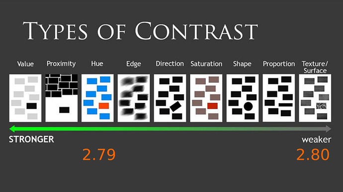
I’ll point out here again that because the new icons are so bright and so noisy, they’re more distracting than coloured icons. the old icons were for the most part not overly saturated (their colour contrast with the background), but varied in hue (their colour contrast with eachother)
Look how far down the list saturation is, compared to value. Apparently they got rid of colour because it was ‘distracting’?
If you look at the list, you can even discern why the new icons are noisy. The old icons had texture, a few had stark value changes, like the camera, but for the most part, most icons used texture (or shading) to vary internally.
The new icons only variation internally is a stark white contrasted to the dark grey background colour. Using full value level contrast internally within every icon in order to create any variation, with no rest from that, it’s almost every icon.
“Many monochrome images” aren’t very small and don’t exist in a sea of similar monochrome images which you need to distinguish between quickly.
That’s stlil only 2/4, and you come into issues when you add colour but not outlines because you gain contrast between icons, but lose it against the background.
Also the devs have stated they want no colour in the iconsheet itself because it’ll mess with the theme’s ability to change icon colours.
This does nothing to help the countless people who use blender default out of the box, and are going to have a poor ui experience.
And the worst part is the devs see no reason to change direction, instead choosing to blame these issues on “resistance to change”.
Maybe someone who had the time and skill would make a better icon set, or fix the old one, I don’t know. But the chances of that when it’s clear the devs are pandering to the mono trend, and refusing to hear any negative points about it, is really small.
3 Likes
I understand your point of view. But if replacing the icon set is made easy (like installing an add-on from an external file), then your freedom to use whatever icons you want will be guaranteed.
It wouldn’t be more difficult than going to User Preferences > Themes and choosing another preset.
The devs are implementing the icons being made by the same person that made the icons for the previous (successful) generation of the program. They’re relying on that person’s expertise, wouldn’t you? I know I would.
Not only that, there’s only one 2.8-icon-proposal thread around. AFAIK nobody else is trying to deliver something different, so there’s no room for choice.
GIMP comes bundled with a few skins. If tomorrow someone created a different icon set for Blender 2.8, what’s to say the devs couldn’t include it as a choosable preset.
1 Like
“This does nothing to help the countless people who use blender default out of the box, and are going to have a poor ui experience.”
So? No-one is infallible, no-one is perfect, no-one is beyond critique. Past performance does not guarantee future performance, especially when the base design philosophy behind the icon set changed. Jendrzych is good at making icons, but his new icon design philosophy is flawed.
“Maybe someone who had the time and skill would make a better icon set, or fix the old one, I don’t know. But the chances of that when it’s clear the devs are pandering to the mono trend, and refusing to hear any negative points about it, is really small.”
3 Likes
Very puzzling arguments.
The ability to distinguish the old icons apart better than the new ones is fact.
Simple counter proof for this claim. Anyone who is fine with the new icons. This generalisation does not work.
Spacing and distance happens to be a very good form of contrast, so increasing the ui size from normal normalises the icons contrast levels when comparing the two, reducing the impact of the other forms of contrast.
As written, I set Scale > 1 for Blender 2.79. Despite, icons are colored there. Whether spacing or distance create contrast: scatter rice to the ground. I guess, you are aware, spacing alone would not get contrast by dispersing rice grains evenly. To get contrast, there needs to be variation in the spacing of the rice grains.
How to place icons; thats not the icon designers job, but the UI designer’s. But, there is a point. Poorly placed icons makes gasping them more difficult.
I have given many un-opinionated points and reasons as to why the monochrome designs are inferior and yet you continue to claim it’s an aesthetic preference.
As said, labels do not create facts. Label un-opiniated does not create objectivity. If you have problems gasping the icons, as some others say to have, thats what I would consider a fact. Instead of some generalisations and other polemics on monochrome icons, it would help if you point out specific icons, which does not work for you that well.
Since there is a paradox – same icons work for others – generalisations do not make any sense.
They are as distracting as you like them to be. As their color can be chosen within theme settings, adapting contrast. Still, you blame icons for how they are used inside UI.
So, pleeeease, spare me those bogus generalisations and theories on monochrome icons. Get real and point out concrete problems with concrete icons. There might be a point, but I doubt we would hit it that way.
2 Likes
I’d bring my support for colour icons.
A feature to switch between colour and monochromatic would be great to please both sides.
My thoughts:
Indeed when looking at the Blender interface from an external viewpoint, monochromatic can look better, especially now we have Eevee, wich gives a colourful viewport on a large area, around 80% of the space. Seen from an aesthetic viewpoint, the color balance, composition of the screen can look more elegant and chic thanks to monochromatic icons, since the eyes will naturally focus on the coloured viewport, as opposed to the monochromatic menus, wich convey way less visual informations.
Now the problem is, when working with a software all day long, you don’t look for a beautiful and chic, color-balanced interface, you’d rather choose the efficiency, readibility of coloured icons. Faster to read, to find and click. Aesthetic may not be important, as long as the workflow is more efficient. And monochromatic is kind of sad and boring. Color is more appealing for the vast majority. It doesn’t have to be flashy icons, even very unsaturated colors would make it better. I use more and more 2.8, and every time I switch back to 2.79 I feel something has been lost.
Additionally some icons shapes are getting too simplified, abstract, which is really confusing.
My 2 cents about it.
5 Likes
Well I can’t go without supporting this set on this 19274 thread about the new icons.
On the matter of color I already said and @Craig_Jones and other guys - multiple times in about half of the 19274 (keep in mind its a estimated number  ) threads - that there are people working on the subject of color.
But how can you add color if you still don’t know all the variables (icons) that need it?
Outliner is supposed to be the guinea pig for the new color coding system to be implemented on blender 2.8 Stable (keep in mind we are still in Alpha).
IMHO, mono is fine until a certain point. I do like it, a lot, and I do like that only some icons will receive color, but until the whole set is done, until colors are defined… well you guys that really wanted the colorful icons are going to be for a rough road for a while. 
As others I do make the argument that you should give to every people that’s working on it, your suggestions. They are being heard… aa erhm… viewed!
@jendrzych, man you’re going to be very famous! If this subject goes on until and beyond Stable releases you will be on half of BA threads for sure
1 Like
Question:
Is it possible to only scale the icons instead of the hole interface?
2 Likes
This should be a good indication that something is wrong and the blender devs need to revisit their decision if no consenus can be reached with the current solution given.
It IS however a pointless thread. The community has shown time and again in these recent years that it is divided into two camps. Those that came to blender for its power and unique workflow and those who are the blender foundation echo chamber who spend their time brown nosing in the hopes they can turn blender into some other software.
Its laughable to say that those of us who dislike the new icon sheet should invest our time or money into making an alternative. Why waste our time when the decision has already been made? Please don’t take us all for fools. We can look at the BGE for example, people were told to invest thier own time in updating it and at the end of the day, they deleted it and took the BGE donation money anyway.
Whats next blender foundation groupies? Blender 2.8 being a purely mobile experience? What? We all have phones don’t we?
1 Like
I think the UI is an important part of the software development, it`s real devlopment. It’s the first impression you have of the software and accompanies you through the whole process. It’s also the first impression what a new user has.
What is the use of best software, if working with it is horrible?
1 Like
The existence of individuals who “are fine” with the new icons is no counter argument for any of the points made about their readability. “fine-ness” is, if it even is a measure, personal and aesthetically influenced.
If 10 out of every 20 machines made in a factory do not work, the fact that 10 work is not proof that the design of the machines is right.
My point is the fact that you use both icon sets at a larger scale normalises the readability of the icons, making contrast less of a factor. Because everything is much easier to read when it’s big.
Labels?
People do have trouble differentiating the icons. The contrast design principles and scale of differentiation given by varying types of contrasts is fact.
I have not ‘attacked’ mono icons, I have displayed reasons why they are worse at performing their primary function than the old icons which utilised more than just form.
Just because the icons “work” for someone (i.e. they don’t notice or care about the readability issues, and ‘like’ the icons, or they have such immaculately fantastic vision it does not factor in, or they have such fantastic muscle memory that visual cues make almost no difference etc.), does not mean that the icons design principles are good. This is no paradox, people like terrible things all the time, people work with terrible tools all the time and aren’t even bothered by it.
If I were to cut down a tree with a butter knife, and I said it ‘worked’, I ‘liked’ it, thought it was a fine solution, that does not mean that a butter knife is a good tool for cutting down a tree. It does not invalidate any arguments suggesting it is a terrible tool for that job.
Another useless “you can customise it” excuse.
I’m blaming the icons design principles and the ui implementation surrounding them. The mono icons require high levels of value contrast in order to be readable, this makes them pop more from the interface than the old icons. You could set their value lower, but then the icons would be even harder to read, because you’re left with no other form of contrast to seperate them from the backgorund.
I have not generalised about anything. I am simply not addressing single icons or the design of single icons. If I were I would be talking about particular shapes or symbols, iconography. I am talking about the design decisions behind the entire iconset and the theme systems surrounding that. I can not be specific about icons because no single icon is perfectly indicative of the entire set and it’s design philosophy. I can not address the readability of singular icons without first addressing the design principles behind those icons that directly influence their readability and the design changes allowed to that singular icon. In order to talk about these things, the iconset has to be taken as a whole complete thing.
2 Likes
Yea, i’ve been keenly using 2.8 , and im not phased at all by UI redesign or key changes, im totally fine with adapting to new things, and my workflow has changed to suit the new design, but im a sucker for visual things like themes and colors in the UI, so i would love colored icons just for the sake of them looking cool, nothing to do with ease of use. Im the sort of person that goes looking for skins to jazz up bland software and apps on my pc especially if they are monochromatic.
But yea i do get mixed up with that world icon and materials icon because they look very similar at a glance so colors might well help differentiate them.
2 Likes
Could someone tell me where the icon sheet is? I asked in the thread and was directed to the first post but could not find anything but a bunch of confusing links to various pages without a download.
Hi, the sheet is in the 1. post, the .svg is white on white background.
You can download with right click > save as.
I failure on this too some time ago. 
Cheers, mib
1 Like
New icons for Blender 2.8 This thread? I can’t see an svg on a white background in the first post. I am so confused 
Yes, its this thread, the first posting. The icons get close to invisible on white background.