How simple it would be to not duplicate UI elements, I would imagine, would depend on how adamant people are to make sure that mouse travel remains at a minimum (ie. not having any duplication in the UI would imply an element potentially being far away on an HD screen).
It’s the ‘dockable dialog’ debate all over again - the vanilla Blender can go far on the deduplication, yet allow user to dock stuff close to where they work.
What theme are you using?
I hear what you are saying. I wouldn’t complain if blender were laid out like this. However, from my perspective, most of these things don’t clash with the tiling/non-blocking setup blender currently uses. Replacing the tiling window manager for snapping windows would be “throwing the baby out with the bath water”. The tiling concept can even do some things better than the snapping windows concept (split or swap windows with a single click and drag).
As for the n-panel, I look at that as something that “wants” to be a custom properties shelf. Forget about the fact that we currently put tile specific settings there. Its main use is as an abridged list of properties users would like to have while in fullscreen. Snapping the property editor there could work, but you are working with something made to adjust the properties of a lot more things than just what you need while working. That was your main complaint about it.
We could split the scene related settings into some other editor and allow the properties editor to become a floating panel that can snap to the side, but then you are still left with all the object specific settings you don’t care to mess with while fullscreen. We’d need customization there anyway. My idea is to just allow the user to summon the settings tabs they want in the n-panel, and pin sections under each tab they use often to a “pinned items tab (or tabs)”. When you hide the tabs the pinned items belong to, those items stay where you put them.
I see the customization system as an icon on the n-panel you can press to get a popover which lists categories for properties tabs. It would be like layer groups in gimp or photoshop. You can press an icon next to the category to display all tabs for that category in the n-panel. If the category isn’t context sensitive (like render settings) then you can expand the category to get a list of tabs which can be displayed individually. There is no need to display each tab that could appear under a context sensitive category (like selected object). We can just enable the category and pin any sub items we want to keep around.
I have a lot of ideas on how we can bring those features you want to the current tiling system. I’ll list them below:
-
Snapping editors and editor windows: I explained how it could be done in blender here. The missing piece of the puzzle is what to do when you alt + drag an editor from a spot that can’t be collapsed in the current system. The good news is someone has made a patch which can handle this situation. Hopefully it will be added to 2.8.
-
Floating editor panels: The functionality is already in blender. We just need to improve how it handles multiple floating windows and allow each editor to be summoned in its own window with a hotkey.
-
Stack-able editors: I wouldn’t consider this necessary because we have the ablity to scroll layouts by pressing ctrl + left or right arrow, but this too can be done in blender. The current system lets you change the editor type by pressing shift + F1-F12. By holding shift down when we select a new editor type, we could have blender make buttons for the new and previous editor types to the editor’s header (It might need a special row for these buttons). This could probably be done with an addon (It would have to perform this action each time you switch editors and make sure there are no duplicate editors in the list).
Well that is my vision for blender. I feel we can keep the current system while adding those features at the same time. Its probably less work for the devs to add these features to the current tiling setup, and we get to keep the advantages of this system at the same time.
1 Like
Some feedback.
1.Thanks for bringing back wireframes.
- but selection has become very slow now - like a couple of seconds for a face on my system. There are a few things still to connect up properly when changing shader settings too but getting there…
- We really need alpha control for a pure wire frames mode - it is possible to get completely lost when navigating in a large scene in the shaded 3d view presently. To see through everything is very important/useful.
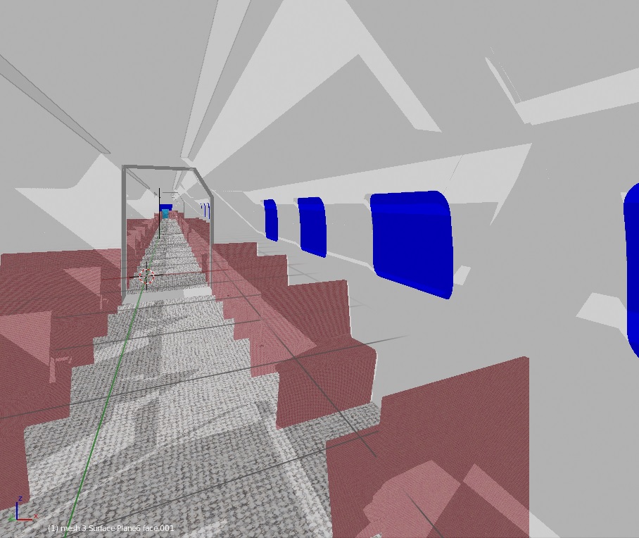
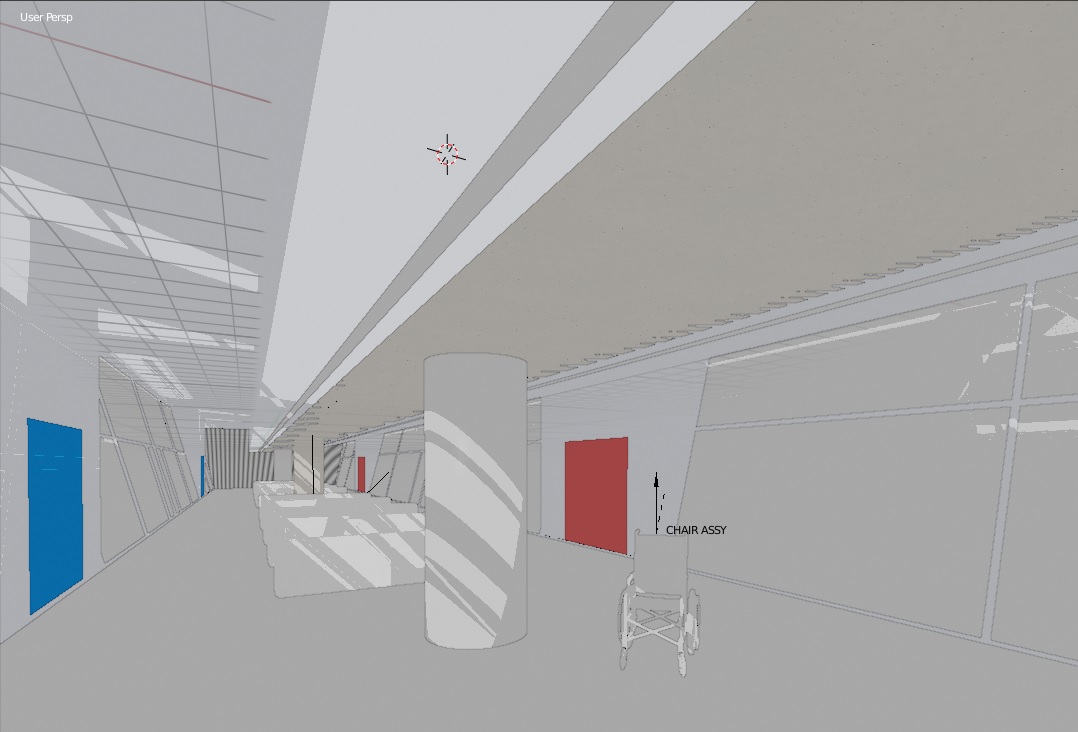
- after shadows were re-engineered and some fixes to that made there are still issues with shadows inappropriately cast inside other objects. attach is a view of a monorail inside a terminal. Some confusion about what is visible to the sun.
- I like Lukas’s 1-2-3 column layout - I could never really understand why it needed to be infinitely variable in width.
edit - forgot…
4. we need per object visibility to come back - please!
1 Like
If you read in link Lukas share, apparently things are complicated for the patch is finally accepted ![]()
https://developer.blender.org/D3445
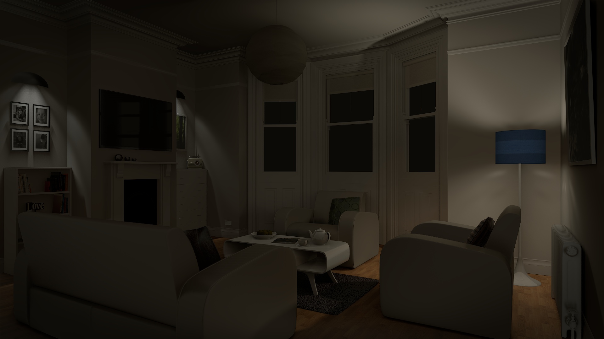
Here I have used The White Room by Jay Hardy scene with 3 IES lamps on Eevee:
4 Likes
Well for one what I wrote had nothing to do with a snapping windows. Everything I wrote can and should be done with the tiling paradigm already. Again these are things that every other non-blocking UI has figured out. The ability to collapse and uncollapse a tile has nothing to do with snapping windows. It would be nice to have snapping windows as well bu that’s a bonus.
I’m not throwing away any babies, let alone the bath water. I’m actually advocating adding a few features to the tiling paradigm which is to simply allow stacking of views as in allow us to add tabs with different views in them in a given tile. The ability to collapse said tile and re-expand tile without having to manually manage that by dragging tiles like one of those picture puzzles to gain more space for the 3D view. Finally the ability to collapse and expand tiles via a key press. Detaching windows is something Blender already does now, I only suggested the each view get simple buttons like you see in most windows in your OS that will make it easy for users to collapse a tile, maximize a tile, and detach a tile. This last one is more for completeness as it should be easy for users to do all of the collapsing, maximizing etc without having to guess as keyboard shortcuts.
Everything I’m advocating is about making the non-blocking tile based UI in blender easier, better to use.
If pressing P literally uncollapses the tile with properties panel in it, what use does the N panel bring to the table? It’s an extra panel doing the same thing that another panel is already doing and since the issue is that tiles are not easily collapsible and expandable, by fixing that you can literally have the same exact functionality as bringing the N panel up without duplicating anything. This doesn’t just work for the properties panel but for all tiles. So if you have the Node editor split on the bottom half of your screen, you shouldn’t need to drag that tile down to collapse it. It should be a simple keypress that brings up the node editor and hides it as needed. No snapping involved.
Swapping views is cool and all but not more useful that being able to easily collapse and expand tiles without having to manually drag tiles all day to get something out of the way.
I guess there is just a disconnect in how the two of us use blender. To me, a window inside an editor that can be collapsed is only good for content that doesn’t need too much space in order to be displayed. I wouldn’t want to have something as large as the node editor as a collapsible panel. I either switch between different layouts with ctrl + left/right or change the editor in my main tile with shift + F3 when i need something like a node editor.
I figured being able to summon an editor like the node editor in a floating window alongside other improvements would cover all use cases. I’ll stop trying to sell you on my customizable n-panel idea. I still think its the best solution, but it looks like we probably wont agree on what the best way to improve blender’s UI is.
It’s quite nice having collapsable editors, at least in Houdini. Now Maya has them application-wide too and it’s appreciable. Not a dealbreaker at all but - right now in Blender if we want to bring up another editor or collapse it, we have two choices :
- change layout - this comes with the small annoyance of having ‘virgin’ editor settings
- split the current editor which is kinda slow compared to a single click on a border
Guess it wouldn’t be too much work to get this working : have a small button on every header that would collapse the editor down to said header.
After a little testing… The workbench really looks sleek, but dang is it slow !
The manipulators… not sure about it. I activated left-click select in the prefs and this is how the tools behave : select geometry with LMB. Activate tool. RMB to launch tool, and while holding RMB, LMB to validate. If I release RMB, it cancels the action. What a weird interaction !
1 Like
In default keymap, cancellation is not affected by LMB/RMB switch. With LMB as select click, 3D Vew mouse gesture cancellation used by pie-menus or Manipulator tweak one are still using RMB.
I think active tool is re-using this. So, using RMB to confirm would be forcing to redefine cancellation for pie-menu and manipulators.
It’s definitely what I felt from all the changes.
The muscle memory, and the familiarity we honed over the years with Blender’s properties editor are now in grave peril.
In the past we at least can get an idea of where things are, by recognizing the pattern and layout of the content inside properties editor. Now it’s all just a list, will we be able to recognize which button is what we wanted with just a glance? Probably not.
The main bug with multires is when i stretch the low res polygons. Hi res details 'explode"
On the other hand, beeing able to project and bake details to the multires mod using a shrinkwrap mode, and conform from another mesh are very useful.
Seriously, with everything in popovers, Topbar is cluterred in Texture Paint mode.
This Tool Properties Editor restores ability to have direct access to palette, brush texture preview, list of images or mask. Who wants to access to that by opening a popover, first ?

OK, this screen capture is ugly. But with ability to hide some of these panels and popovers that you decided to move to this area and new panels with a simplified look for 2.8 instead of 2.79 panels.
I think that we would be able to achieve aerated workspaces.
I wonder if they will move sub-object transform to the properties editor as well, a object/element toggle (like inside the N panel), that would be a nice touch.
Just told the material to be refractive, that was all.
The problem (as I see it) with your workflow is that if I want the node editor open I would have to create a layout for that, then a layout with the properties panel open, then a layout with both of them open to get something that if I could collapse a panel I don’t have to worry about layouts at all. Layouts imo should be to create a different context for different tasks. Like an animation layout, material layout, rendering layout etc.
I mean all tiles/views can already maximize and restore the tile, why not collapse and restore as well? If you can easily collapse and restore tiles, then you can easily collapse and restore the Properties panel, which means that at some point the N panel will be taking up precious horizontal space for no real reason.
Now I’m not saying that we shouldn’t be able to create a custom panel with your most used parameters, but that should be something that Blender should allow users to easily create on their own without having to script anything. If Blender had a create blank tile option, and gave you the ability to drag and drop or pin parameters to that panel. That would be cool too.
What I’m saying is that completely duplicating the properties panel inside of the N panel as some suggested is not the way to go. It’s a brute-force solution to a fundamental problem with Blender’s non-blocking UI implementation and lack of way to easily create a custom interface without having to script it. It’s a duplication of effort (and thus waste of resources) for no real benefit, lacks finesse imo, doesn’t address the underlying issue.
2 Likes
Yep that is another problem multires. has 
Really, all you need to do is press shift + F3 for the node editor and shift + F5 to switch back to the 3d view. I use alternate layouts when I want more changes. I’ll often customize a couple of layouts and switch between the two. I’ve never felt this to be lacking. I wouldn’t gain much from being able to snap the node editor (or any other editor) into the edge of an editor as a collapsible panel.
I do see the value in being able to turn any editor into a collapsible panel. As I said, I wouldn’t hate blender if it were set up that way by default. Its just that, in my opinion, you would only want that arrangement if you wanted to have access to a select set of settings while in fullscreen. The n-panel tries to provide you with this, it just isn’t customizable. We need customization there in the same way we need artist friendly custom pie menus.
I would be ok with killing the n-panel in favor of having collapsible panels If there were a “custom panel” type editor I could use in its place. That would be a lateral move at best and a wasted opportunity to bring out the full potential of the n-panel.
It seems like under the hood its already capable of doing most of what we want. Look at how the blender pro template changed the n-panel. That was done with whatever limits 2.79 template system has atm (It has been said that the interface is built in python). They already plan to add tabs to the n-panel. 2.8 is a good opportunity to make the n-panel a better fleshed out experience.
I like the Blender Pro template. I had never heard of it but it’s the direction I think the BF should be taking.
1 Like
I think that Motion Path is back in Blender 2.8. No changes between the previous versions and the 2.8 version though, changes can happen later.