This week’s theme: Adventure
Which entry would you like to see win?
(If you cannot decide, pick up to 3.)
- tylerkjkjkj
- Vampy_monkey
- Gismo_Wander
- object
- benibrahim
- Watndit
- Millani
- david.speer
- ARandomHowdy
- KickAir_8P
- rigoletto
- MatthewK
- 2Rock
- fcharr
- 3dnotguru
- beau11
- Boder
- texasfunk101
0 voters
After 2 days of voting, a winner is declared: The voting will close on: Wed, Dec 9, 2020 11:00 PM.
The winner picks the theme for next week.
If the winner doesn’t supply a theme before Thursday 22:30 GMT, the organizer will select the theme. In this case, the winner’s theme will be used the next time we are lacking a theme on Thursday 22:30 GMT. 
Having selected the theme, the winner will not be eligible to enter that week. They may however still submit an image, but it won’t be included in the voting.
This week’s winner:

Pure Entries
• tylerkjkjkj: Cloudman
• Vampy_monkey: A slice of miss adventure

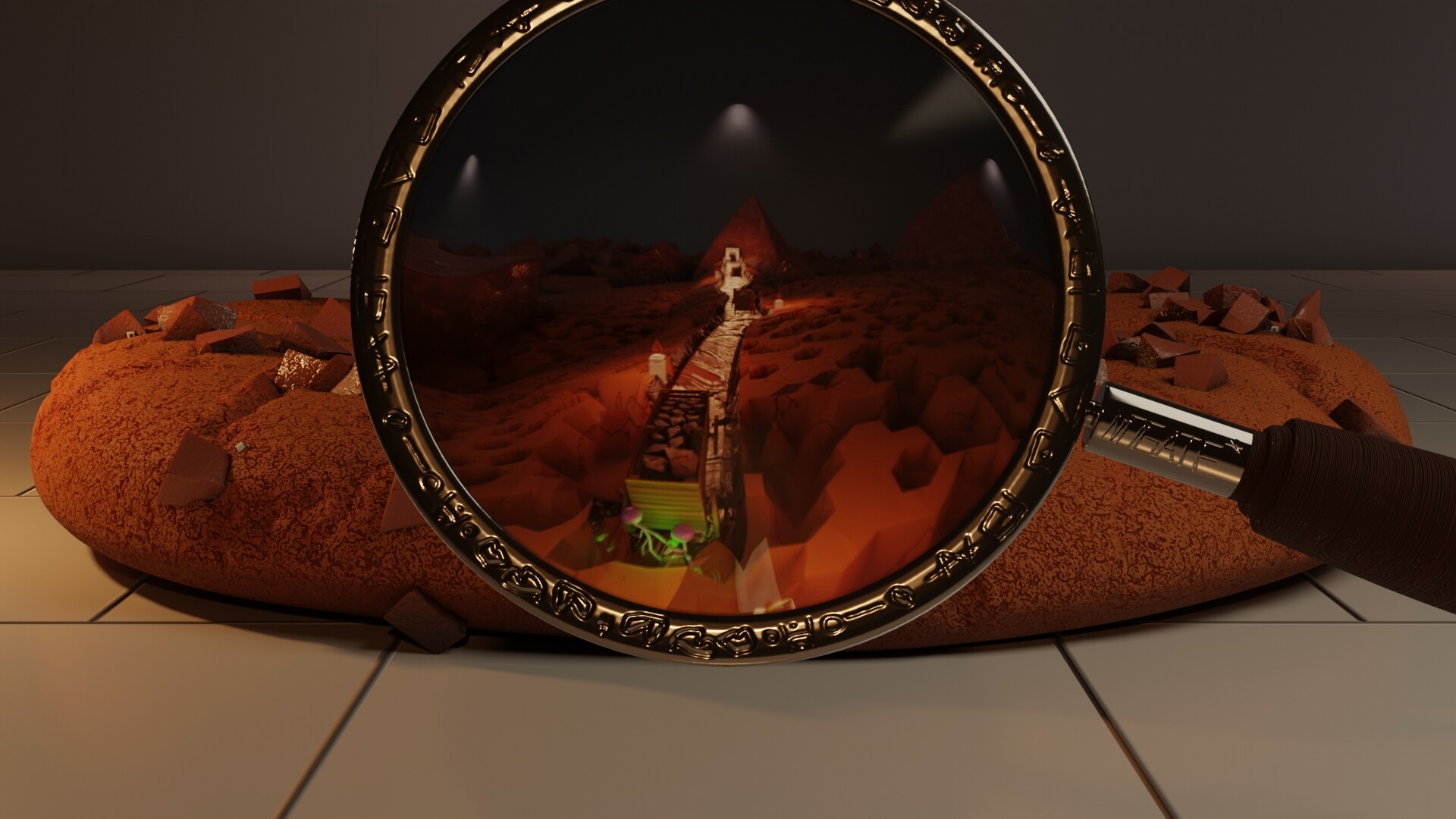
• Gismo_Wander: The secret journey through cookiland
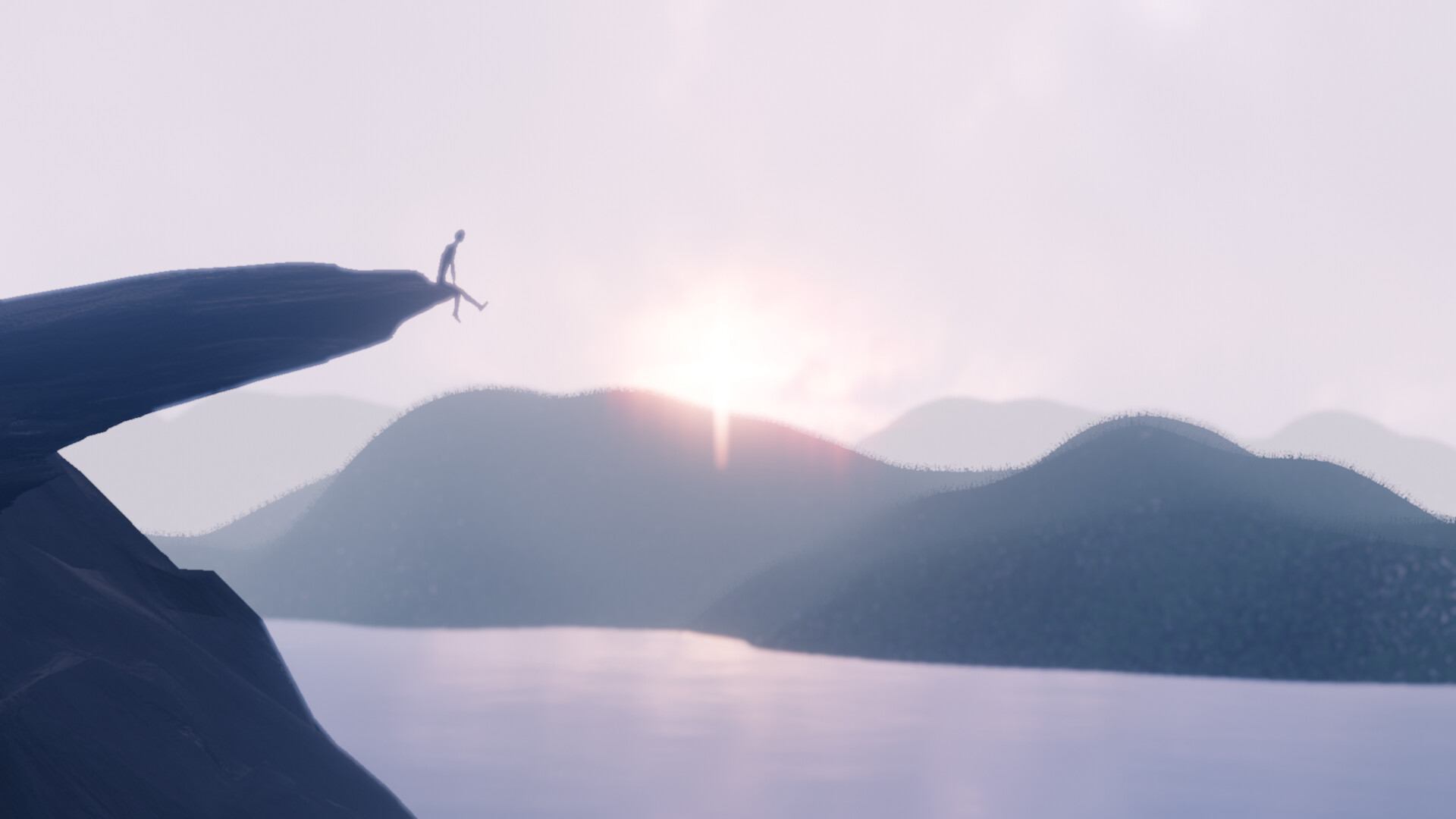
• object: Living on the edge
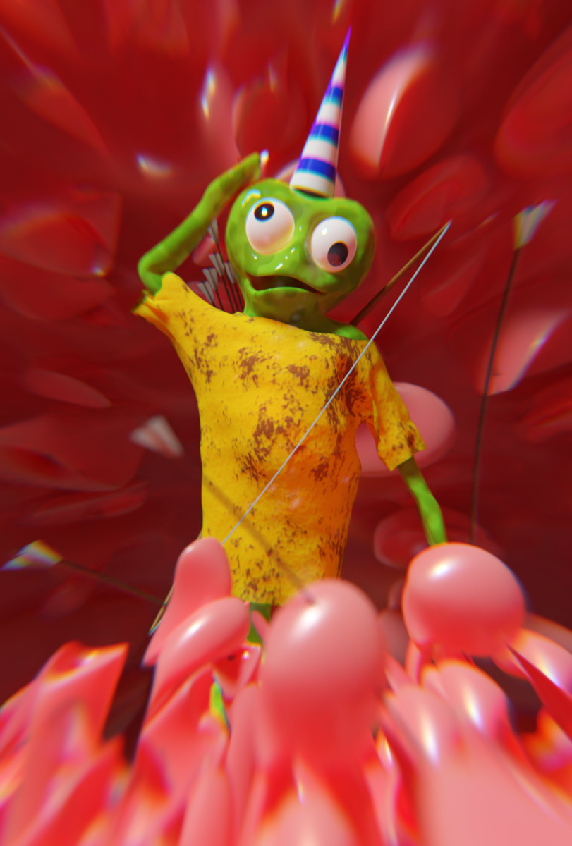
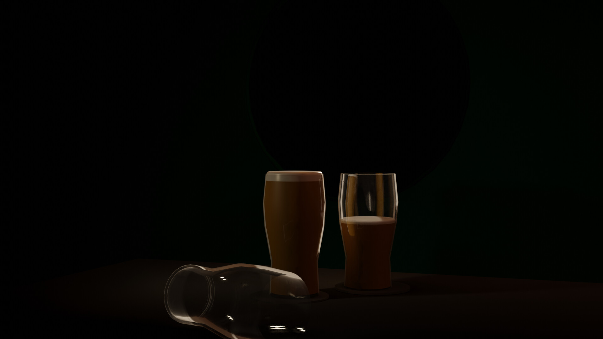
• benibrahim: Adventure after a certain age. Hic!
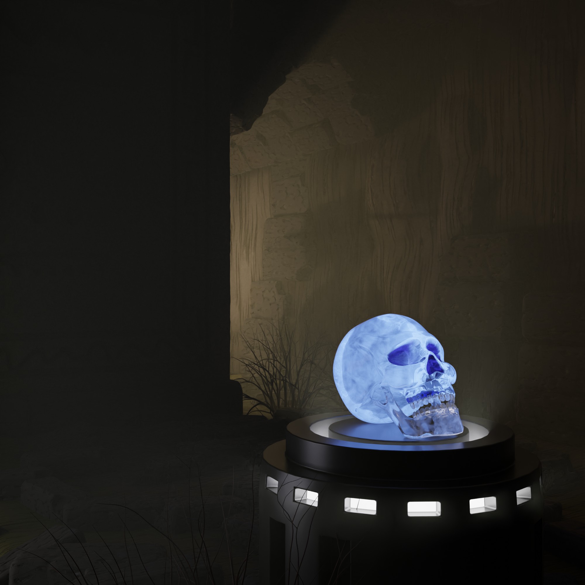
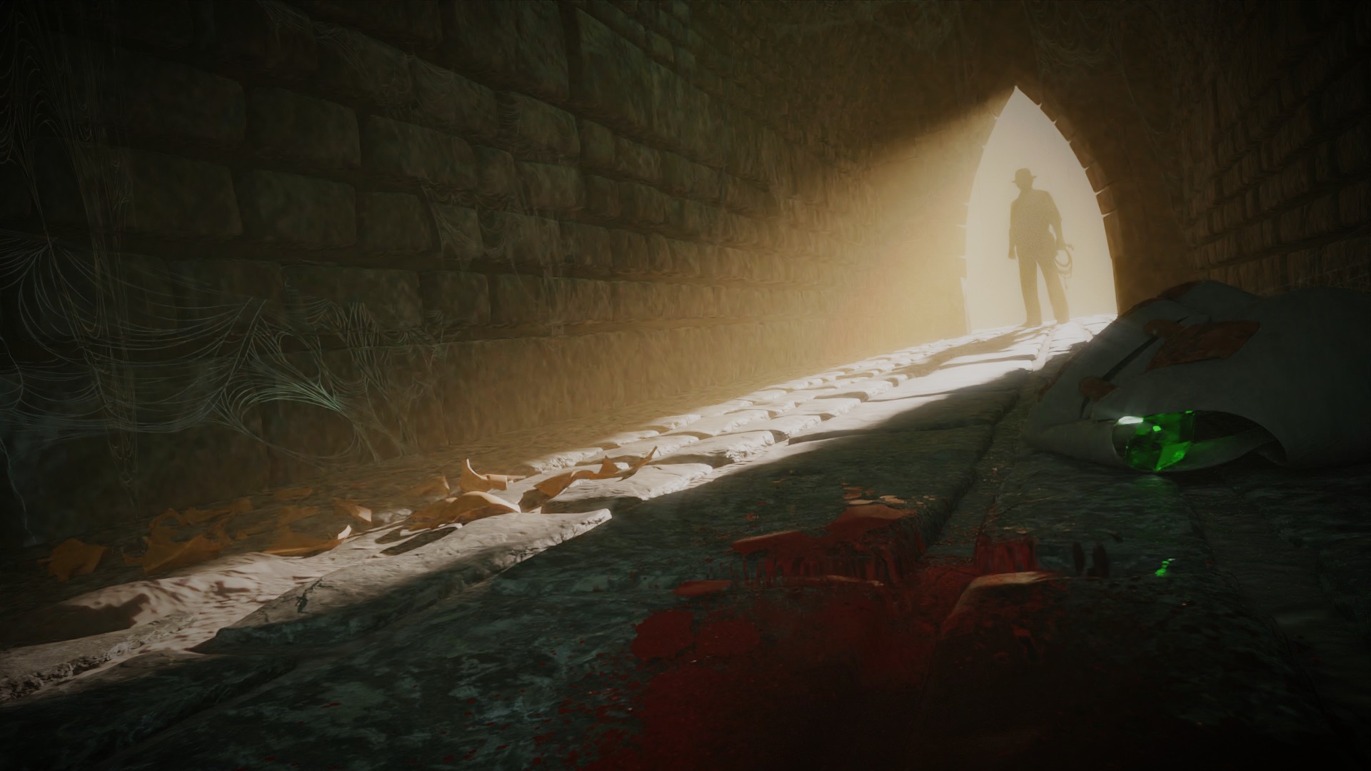
• Watndit: Crystal Skull
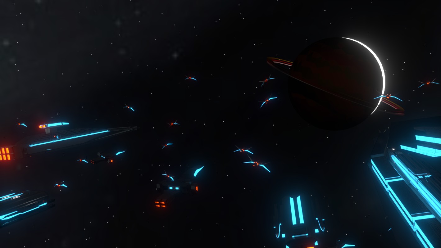
• Millani: Space Explorer

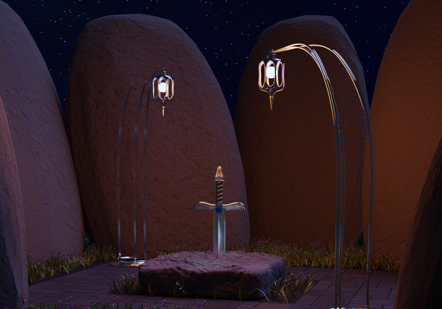
• david.speer: Adventure is Waiting
• ARandomHowdy: Space project challenge artists5
• KickAir_8P: Suzanne - The Adventure Begins

• rigoletto: Puss in boots
• MatthewK: Adventuring can be dangerous
Open Entries
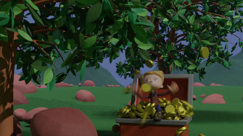
• 2Rock: We’re here
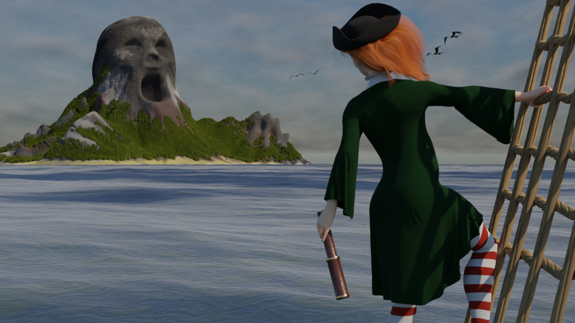
(I’am calling this one open rather than pure. Because although everything in it was made in blender for competitions they where not all for this competition. The sky and clouds came from my “Airport” entry, the birds from my “Flight” entry and the explorer was adapted from my witch in “Fear of hights” , just needed adaptations to her hat and then let the cloth do its dynamic thing )
• fcharr: Road Trip

(Open entry 1000 samples. Reused models from
Discovered in Ice :: Chilling (franciscocharrua.com) and
Aircraft and Air Vehicle :: Little Red Hover Car (franciscocharrua.com))
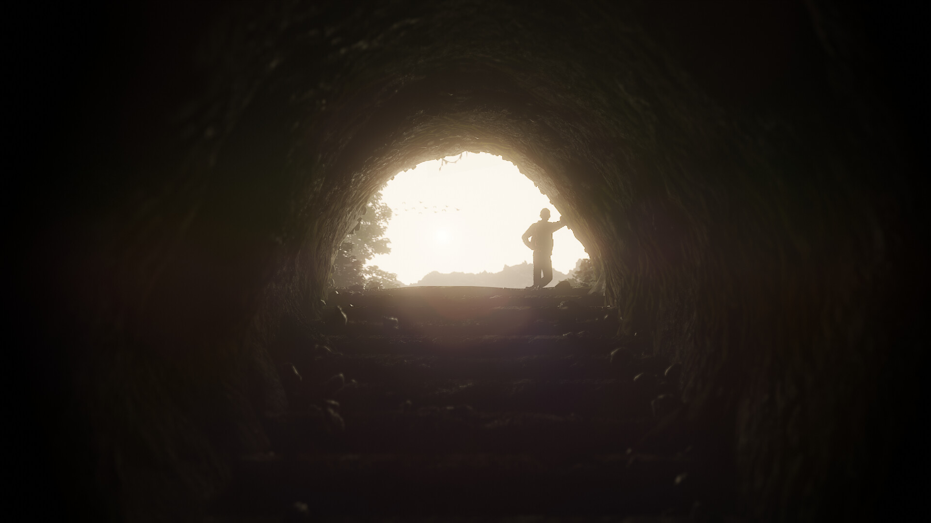
• 3dnotguru: Speleology
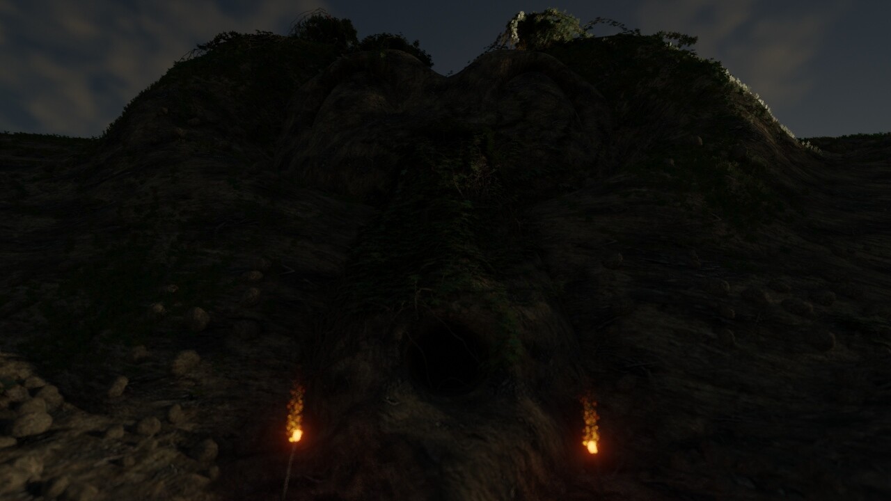
(Open because lot of Ivygen used. Cycles 256s.)
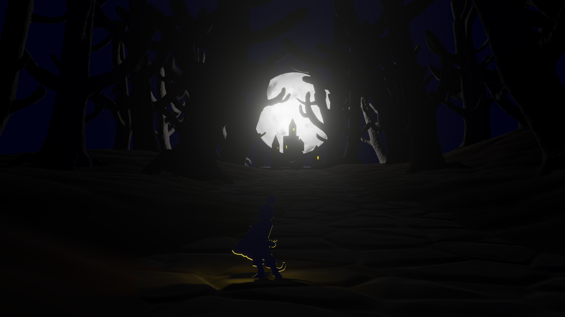
• beau11: Adventure is Out There

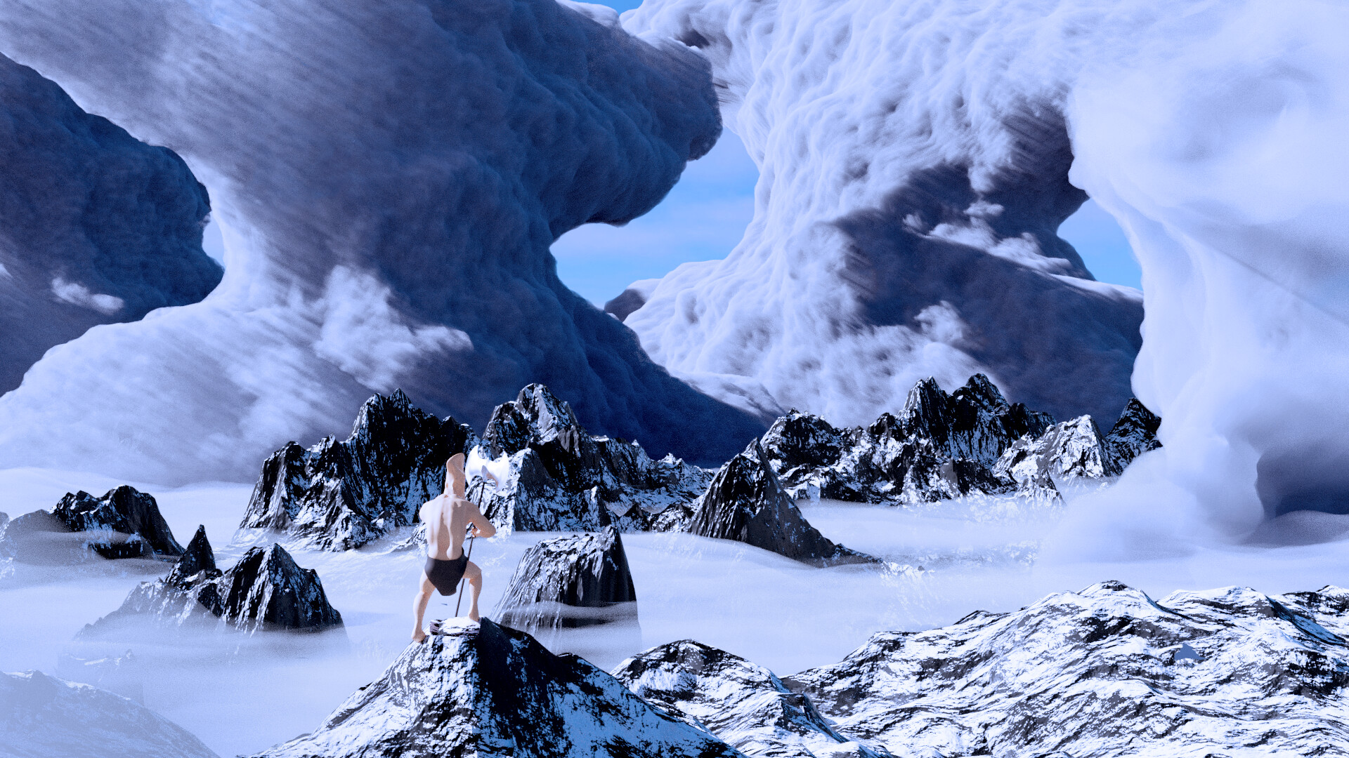
• Boder: A Boy Out for Adventure

*(Modified character model named Ty from Mixamo
Rocks made with rock generator
Mountains made with ANT Landscape
Tree made with sapling
Modified materials:
Glossy Orange Wood by 19seanak19 (CC-0)
Gold from Treasure Chest scene by Gunses (CC-0)
Metal-raw/MetalSurface by loranozor (CC-BY)
)*
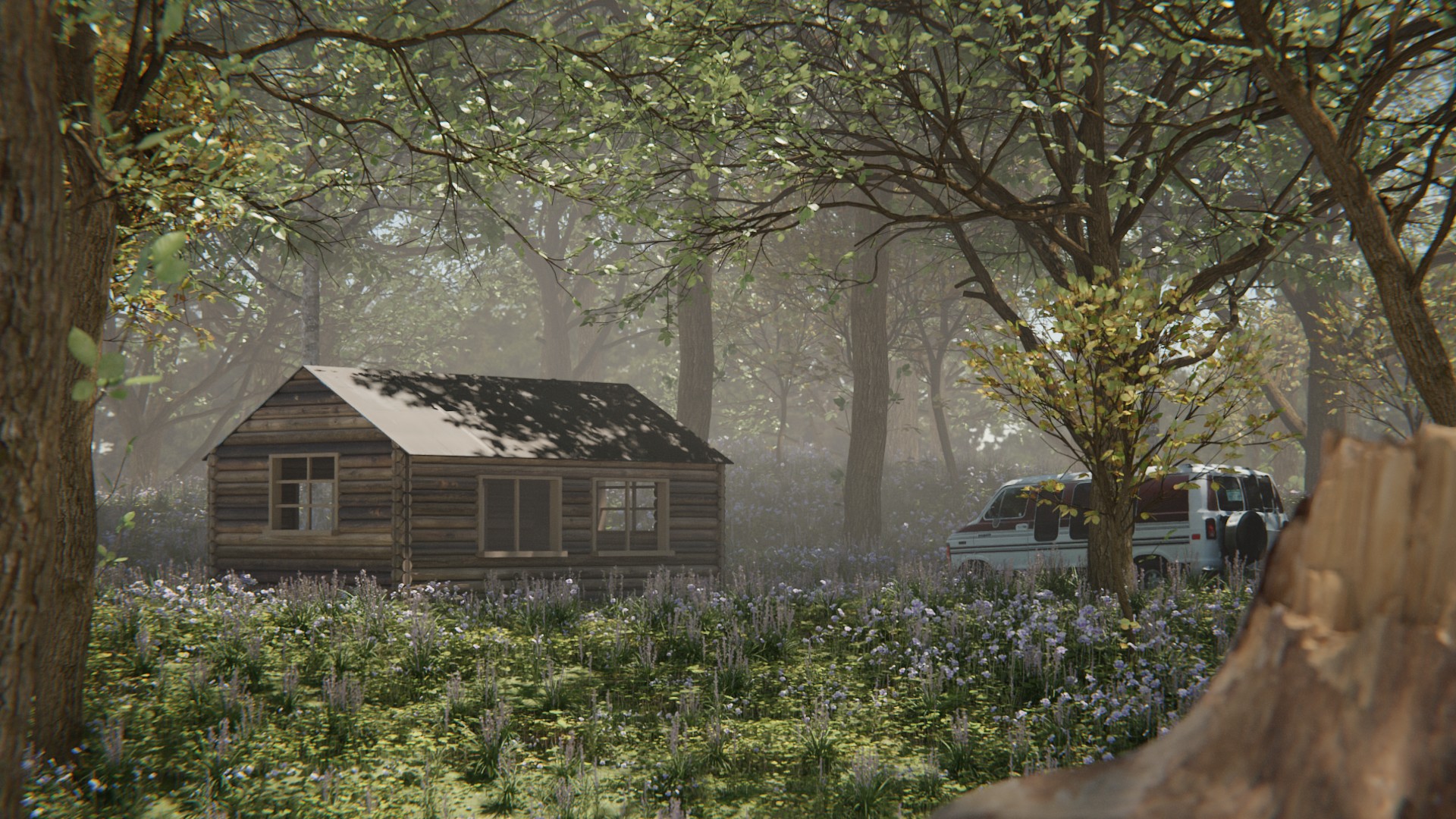
• texasfunk101: Get Away Cabin
Non-competing Entries
• Helge: How did I get into this?