My 1st Blender Project Mother's Cafe

Hello Everyone!

I am new to Blender, I have been at this for about 2 months now. I do not really know what I am doing so I don’t really have a lot of confidence if my work is any good or not. Since this is a post for “Works in Progress” , I am going to get brave and make a post to get some feedback.

This is for an animation project I am considering. The characters are toonish so I am not looking for ultra-realism (however it would be nice to create that type of work). I have made everything except the images on the walls (internet downloads). I do use other software for character creation and animation.


Full Render


quick render


quick render


quick render

Let me know what you think. Do I have potential? LOL It’s ok to be honest, please be kind though. I know I am not great. :slight_smile:

Thanks
Michelle

24 Likes

Welcome to BA!

That’s a nice first project and looks very good already!
Definitely keep going because you seem to know what you are doing. No reason to not have confidence!

I’m not very knowledgeable about the particular art style but here is some feedback:

  1. You seem to have some scale issues. The kitchen appliances in quick render 1 seem very low heightweise. The working height seems to be on thigh height. Also the bar stools in front of the counter in quick render 3 seem to low, making the rest look off scale wise. The counter becomes to small as well, while the cooler and tap appliance back at the wall seems huge compared to it. It may be perspective, but it’s always good to place a correctly scaled human figure in your scene just for reference purposes.

  2. The diner and kitchen look unused. Like in off-the-shelf clean and not lived in. Don’t know if it is the style/idea you’re going for, but it’s something to consider at least.

Maybe others can add some more feedback.

Keep it going, you’re on the right track, I’d say!

1 Like

Thank you WK042 :smiley:

I agree, the scaling has been a bit of a challenge. I can bring my characters into Blender however I could not move them from the A position. I just learned to rig and pose LOL. I have been exporting the project into my animation software and adjusting as needed for the characters.

This is how it looks in the animation program. Everything has to be set… textures, lighting etc… Since I am scaling I have not taken the time to complete it all until the diner is finished. I still have some thing to make, Milkshake machine, coffee pot, pots, pans etc…

I do use a very wide lens when shooting visuals to get as much space in the frame as I can. Makes me feel like I am standing in the room in a sense.

Thank you for the tips!!! and the compliment. That was nice to hear and gives me a little hope that I can maybe think of getting out of graphic design and into something new. I am LOVING all of this!!!

:smiley:

2 Likes

Great job overall! :smiley: The exterior looks realistic and believable as a physical setting from afar.

I can see lots of attention to detail in the interior as well, which is key in selling the believability of a 3D space (even if the overall style isn’t necessarily PBR.) Something you may want to do is add more surface imperfections to your materials, which will add a whole other level of detail. (However, since you said your characters are going to be toonish, this may potentially end up making the characters look out-of-place. Just something to keep in mind. :slightly_smiling_face:)

While it’s commendable that you took the time and effort to make almost everything in the inside of the diner, I’d recommend not doing that for future projects. :sweat_smile: If you’re intending to make an entire animated short as a one-woman production team (at least for now) you’ll need to save as much time as you can in different areas. Just animating the characters could potentially take a couple weeks or months on its own, and adding an extra 2 months for creating the environment means you’re potentially stuck for 4 months on a single project. That’s a lot of time, especially if you’re just learning animation. If animation is your focus right now, then focus on the animation; the environment itself can be built using assets found online, saving you time in that department. :slightly_smiling_face: (Just as an example, for my last 2 or 3 personal animation projects, I reused the same hallway I modeled and textured in an hour just so I could get right to animating the cameras and characters. This definitely saved me time, but animating Resident Evil: Covenant still took me 2 whole weeks to do. And the character animation here isn’t even that crazy or detailed)

Looks great!
Great work!
What’s next?

Trap I feel for is wide lens all the time, remember you can do more then 1 render, story and focal first :slight_smile:
Guess thats another point, I build for a camera rather then make a scene and put a camera in. Less work and less stuff missed in the final render <3

You’re making much faster progress than I am. I’ve been working on a restaurant for like 2 years now.

1 Like

Hi Ulan,

The struggle between too real and too toonish is a very fine line. I guess I am looking for an overall borderline between toon and real life. I am still working on the balance.

I also agree that I do need more work on the textures. Texture painting is next on the list to learn. I have seen a video on this and it does give more depth to the scene. I need to learn to do that. I purchased an addon here in the marketplace… Urban streets or something to add the city around the diner. Excellent addon, the guy did a really nice job creating this. But I am afraid it brings too much realism into the scene. But that is something I can work on afterward.

I use a program called iClone to do my animation. I am no stranger to purchasing content. I have done one little short that I think is pretty good and a few little silly things… but nothing since. (https://www.youtube.com/channel/UCc_THWc2vkBblGl7aCR9iww/videos) I was spending a lot in content, I get an idea, start to build it then start another project. After a little over 7k in software, plugins and content… I decided that I wanted to make my own props, clothing and hair. Thus bringing me to Blender. I don’t do rentware so this was my only option and being I am learning, free was the real key for me.

Where building everything really does take a lot of time… it also helps build my skill. I have learned so much from the time I started to now, I almost want to start it all over and do it better. The neon can be better, smoother. I made a neon sign to use for my website, this one came out almost perfect. To be honest, I like creating people, building sets and making scenes much more than animating. I have been so burnt out on graphic design, I hope to get good enough to do this full time and enjoy my job again LOL.

Fellicia…

Not sure what’s next. Maybe animate this into a mini series? IDK… everyday is something different with me LOL

thinsoldier…

I have no life… I go to work, come home and sit here. I play and play with things learning what they do, I watch youtube videos… and hope I can imitate the moves with the same results. If you want it bad enough, work hard, invest the time and it will come :smiley:

1 Like

lol, you go to work. That’s alread 2x more life than I have. I have no good excuse for my lack of progress.

1 Like

There’s a game/game series called Borderlands that I think does a good job with being both toony and realistic. The visual design of the games is definitely not PBR, but the overall feel of the game, coupled with the texture details and the animations of the characters, isn’t particularly stylized. You may want to check out some gameplay footage to use as visual reference, although I’m sure there are other games out there (perhaps Fortnite?) that are objectively less stylized than Borderlands. Regardless, looking at different styles used in different froms of media will help you decide what feels “too toony” and “too real”, and ultimately you’ll be able to cherry-pick aspects of different designs to create your own distinct look.

There’s a Post-USSR building generator that creates stylized and customizable buildings using geometry nodes…I just can’t remember who made it and where it can be found. :sweat_smile::man_facepalming: I’ll try looking for it later and attach a link, if I find it. It’s both free and Cc0 (basicslly public domain), so it should suit your needs perfectly…

Edit: Found it! https://kypcaht.gumroad.com/l/PmCLJ
Not 100% on it being Cc0 now, though. I could’ve sworn it was, but there’s nothing to indicate that it is (ot isn’t.)

Ahhh…well then, you’re on the right track. :joy: Keep in mind, though, that once you’ve made a circular bar stool and then _re_made it more quickly and efficiently, there’s not much more to be learned by modeling a third circular bar stool. Basically, what I’m saying is making things from scratch is great for learning and for practice, but if you already know how to make something then you’re wasting time by re-making it instead of just downloading a suitable model and moving on to a different modeling task.

For example, if you wanted to do an interior scene but you already know how to model curtains, chairs, tables, and couches, why not just find some models that go together and focus on the interior design aspect of your scene? That way, you get stright to the learning stage without re-treading old ground. :slightly_smiling_face: (If you want, I can recommend a couple of sites that provide free Blender models. Although, even if a model isn’t in the native .blend format, you can still import something like an OBJ or FBX file into Blender; you just need to add the textures in manually.)

Bro I feel exactly the same. :joy::joy::sweat_smile::sweat_smile:

So… ok… playing with textures and trying to get a more “lived in” look LOL. Honestly, I was thinking the same thing… for me the term was sterile. But hey, a brand new development, new business and still under construction will have that look LMAO. Of course, virtual characters do not make a mess, spill coffee and so on…

I purchased a plugin called Smudge Pro… 1st attempt, have no clue to what I am doing hahaha… I will read the instructions eventually. :wink:


This is a cycles render


This is an Evee render

The look pretty close and Evee renders much faster. The cycles render does look better though imo…

I had to take the booth out of scene to do this. For some reason my cycles renders are really slow. I am not sure why but they use to be faster. Hmmmmmm. Ran a virus scan and nothing.

Not a bad thing doing so either. (taking the booth out of the scene) I have gone through and refined some of the edges, I have been meaning to do this as well so kill two birds thing. I have also been told to build each object as individuals then assemble in final scene as prop imports. I have everything contained into one file atm. IDK, seems that if I am importing into another software to animate, why not bring it in whole?

Knowing me, I am going to keep changing things over and over and never finish it. :smiley: I seem to do that with everything… I can never get to a point of satisfaction of where I can say… Done!!

Does it speed up if you change the material on the booth? Sometimes complex materials can take longer to render or high quality textures can use up a lot more memory which can sometimes make things take longer. In other cases a complex material can be rendered by cycles instantly while making eevee nearly unusable in the viewport.

Maybe you checked/unchecked Noise Threshold in your render settings? Or maybe you accidentally altered the image output/render dimensions? Maybe the Light Bounces reverted back to the default 12 bounces, but you had them at 3 or 4 for your other renders?

…I’m just listing stuff that’s tripped me up in the past at this point. XP

Sorry for the delay in response… Been busy with work and rebuilding this booth. I was having trouble getting good texturing images. Nothing looked as good as even Evee… LOL. I was getting many errors on the mesh, edges not defined or something… anyway… stressed to the max… I decided to separate the bench into pieces and not one modified cube.

It was a lot more to image but worth the time it took. I am now getting consistent results in my renders from Cycles, Evee and in my other software, Iclone.


Cycles Render


IClone Render (interesting white background that got in there some how… LOL it’s not white in the original.)

Lighting is different, but the texturing is very similar. This was the objective.

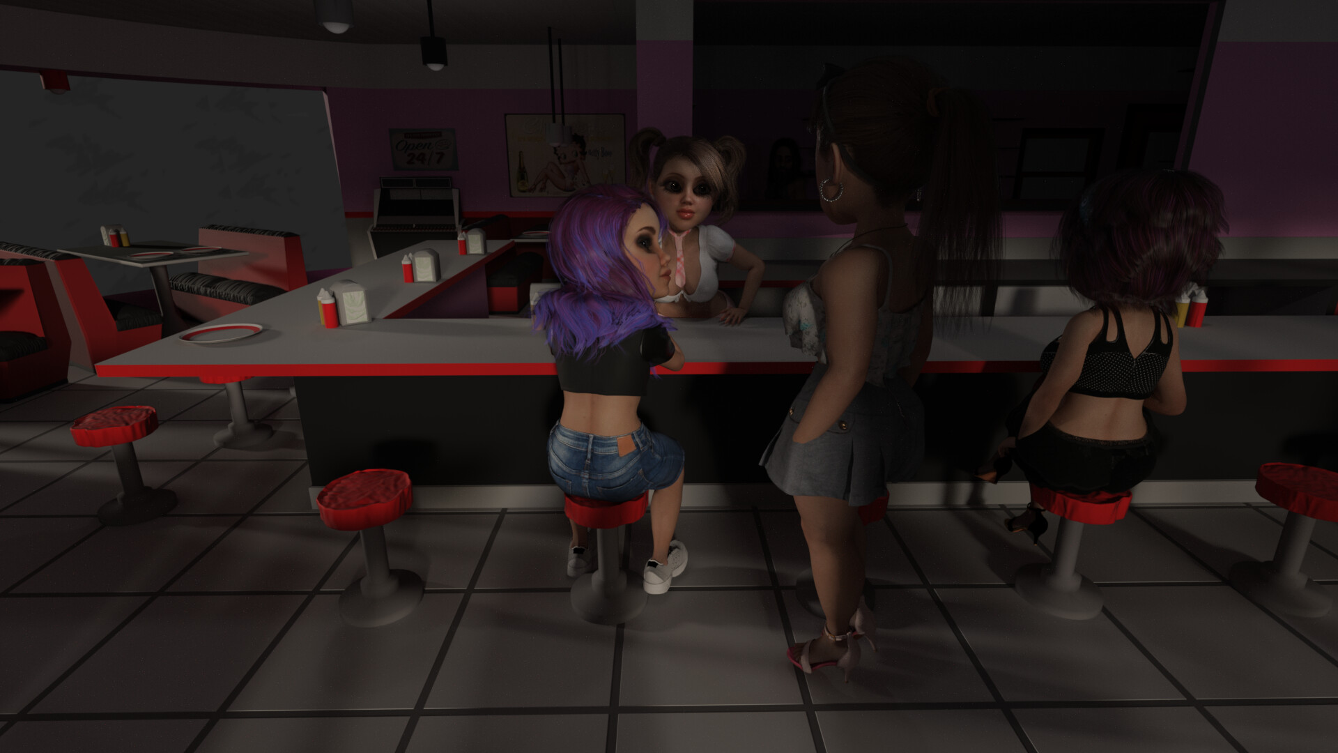
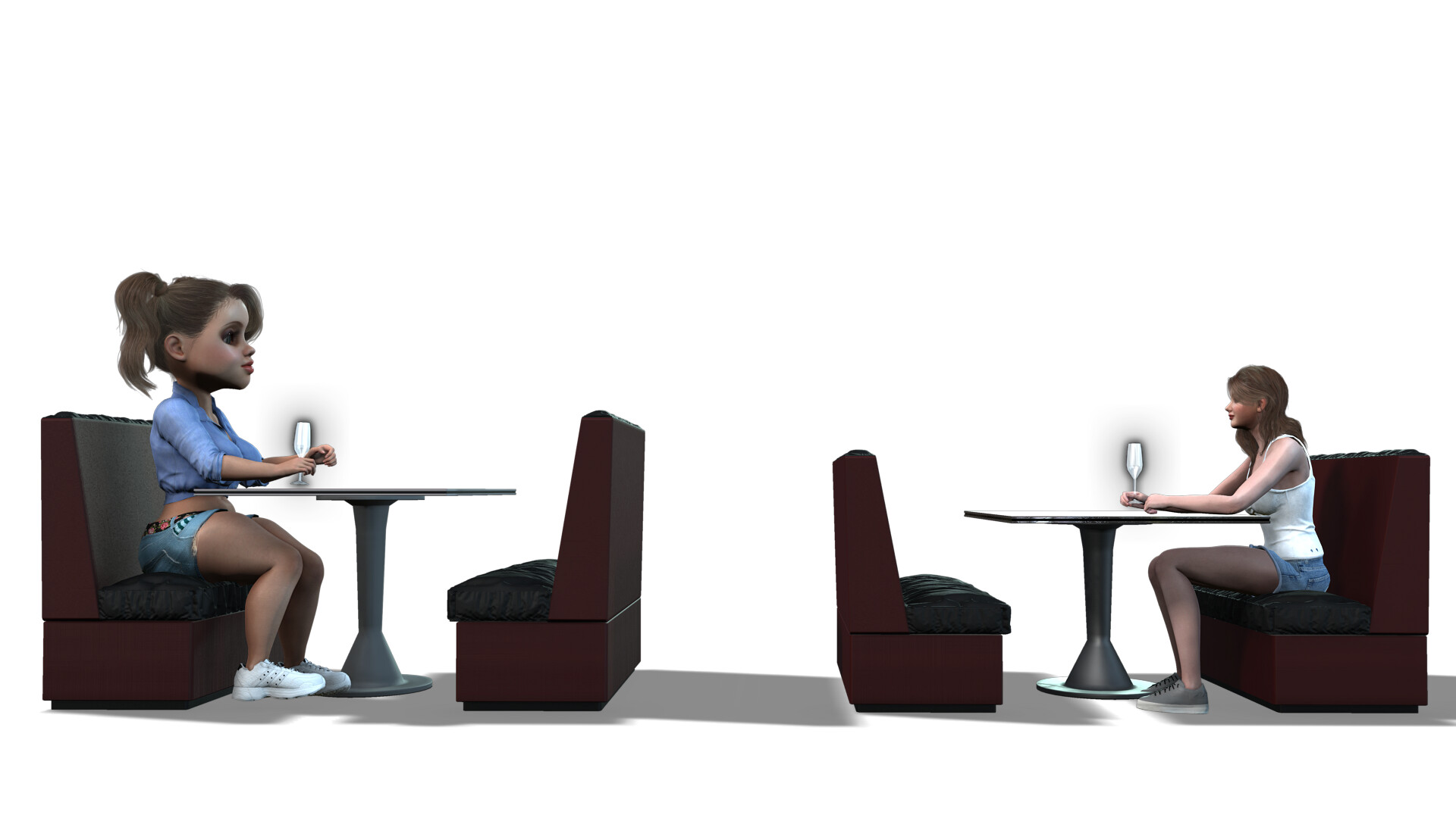
Also… A big Thank you to the one that suggested I go back and look at my proportioning. Where they did look pretty close with either character, I do notice a drastic difference when both in the same scene. Although… camera perspective can make it work LOL.


(a quickie in action)

Thanks for the tip for getting props. If I was doing this strictly for my own project, sure, that would work fine. I started this for an idea I had for an animated short… but I am also tired of my current career and want to change. I may put this up as content for purchase. If I do that, I cannot use items from other artists without permission or consent. Rather do it all myself and have total control LOL…

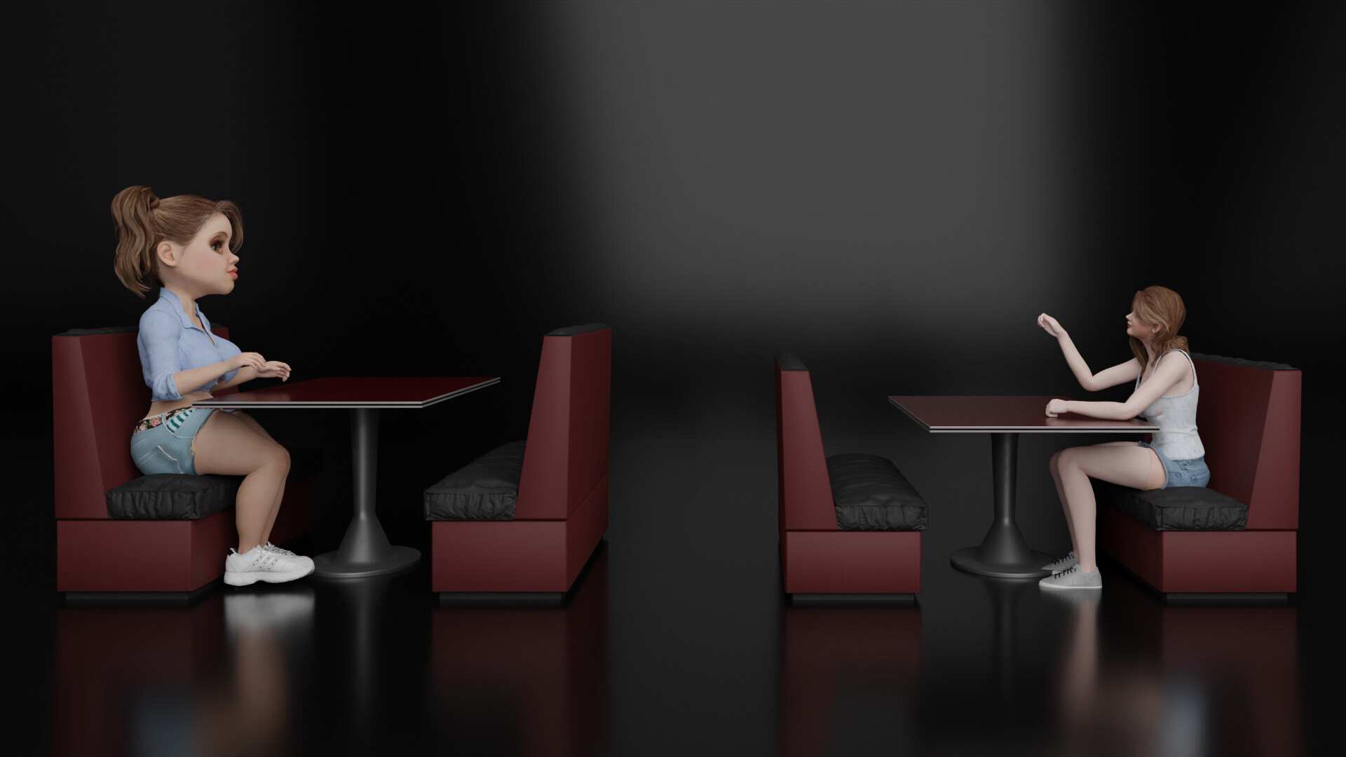
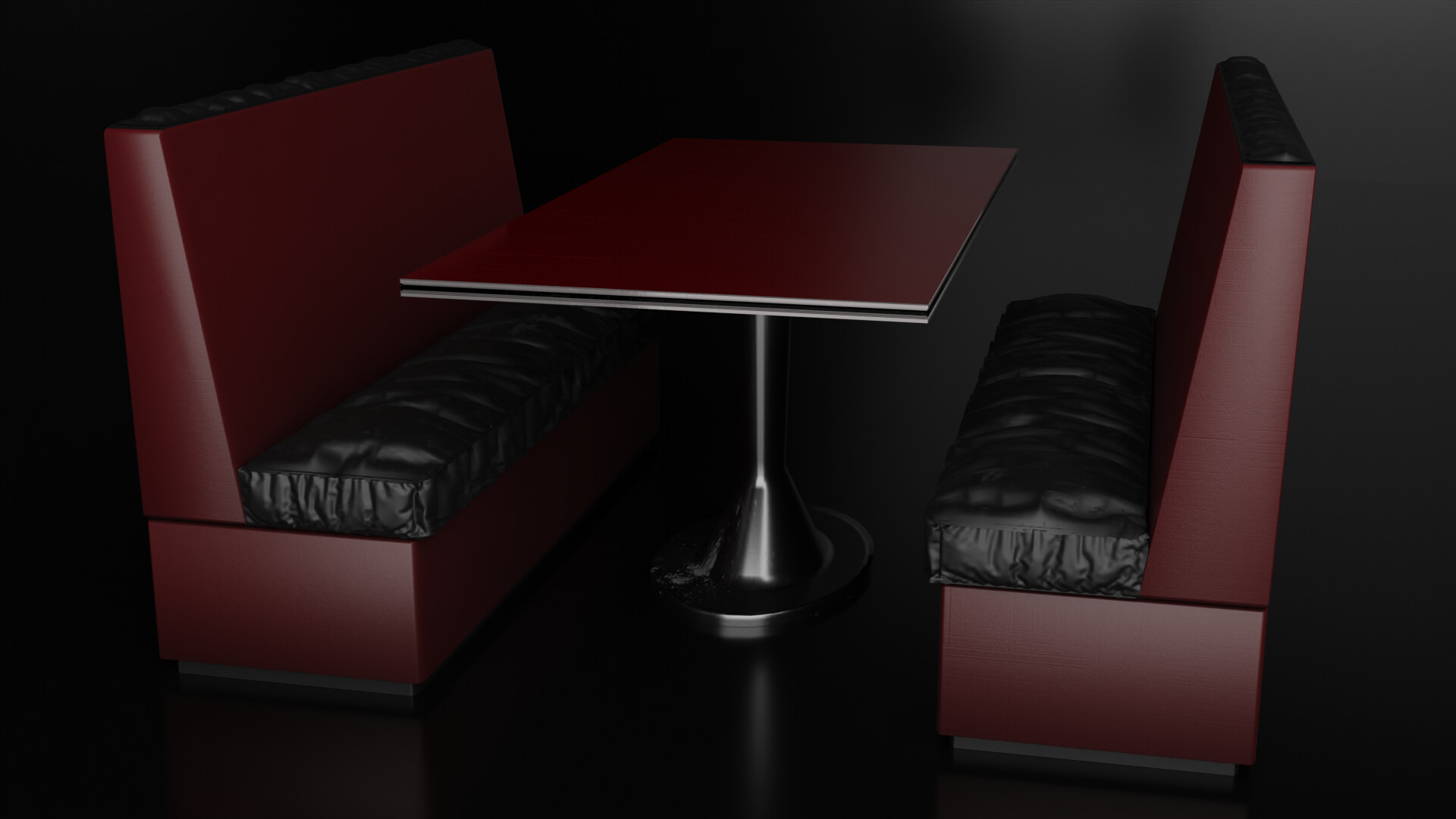
Besides… Look how much better the benches look now that I have separated out the pieces, base, bottom, back and seat. The UV map came out much cleaner this way as well.


Old Version.

New Version - Cycles Render

I will check out that building generator. I am not sure how soon it will be needed, now that I will be going back in and re-scaling everything down to regular human size :crazy_face: Well, not really that bad, I had to go back and re-do all the texturing anyway… just ran everything through the blender shading nodes… everything still needs to be imaged and attached. :sob:

Today is my Friday… The next two days will be total conversion/rebuilds. Woo Hoo!!! :rofl:

Thanks for all the tips everyone… keep em coming… they are really helpful!!! :+1:

EDIT: Oh yes… the slowness is from the mesh. The seat cushions seem to be , not sure the term, have a lot of squares… LOL. It was generated from a cloth simulator.

1 Like

high-poly, dense geometry, dense topology. This also results in very large file sizes. For unimportant object that aren’t being animated/deformed use the Decimation modifier to reduce the polycount while keeping 90% of the sculpted details.

The cloth mesh is pretty high, default setting is 1000. Since I am new, I just assume that is a good density for cloth. I can try to adjust that.

The “old” version of the benches were one block, cut and stretched. Even in the new version with more parts, I did have to add mesh to it as the animation program I use triangulates it’s mesh, blender is squares… So if I have a large area, the triangulation in the objects pattern is very clear as the mesh does not align with the imaged texture. In order to get a nice flat surface from my textures, I need to add some mesh before triangulating on export… the smaller squares seem to fix this issue with IClone (my animation software).

“Decimation” Ah, ok… I will look into this as well. I believe I have seen it in the menu but have not tried it LOL. My learning technique is a bit bizarre… I just jump in and start playing till I get to a point where I get stuck then look up how to do that one thing. I have never really read any books, taken courses or anything… so there is a TON of stuff in the program I have no clue to what it does or how to use it.

I’m sure that will be a downfall or maybe even a slower learning pattern. Who knows… it works for me. LOL. But on the flip side… not having to worry about things I will not be using, like animation (I have something else for that.) I save time not having to deal with it. At least not at the moment. LOL. I really like Blender better than the other software I have… the renders are so much better here… but they do (iClone) make it easy to make animations in half the time.

Good lord… the coffee has kicked in and I am babbling like a fool :joy:

Thanks for the tips thinsoldier… I will definitely look into that and see how to use it :+1:

Usually, what people do is they separate complex models with different parts or components into different objects (like what you just described.) So if you’re making this type of cafe booth, separating the cloth seat and the other parts from the bench makes sense: Now you can increase or decrease the resolution of the geometry being used in the cloth sim without creating unnecessarily dense topology on simple surfaces that don’t need more detail (like the main bench/booth structure.)

By and large, having square faces in Blender is the way to go. If a face isn’t square, if it’s rectangular or something, that means there’s less detail along one axis (the one with longer edges) and sometimes that can be undesirable. That being said, the “have square faces” thing isn’t a rule, sometimes having rectangles is okay as well.

Quite a lot of people learn stuff this way, apparently. :rofl::rofl: I mean it has its benefits, and as a learning technique it can’t be beat in certain respects. Personally though I find this process a bit inefficient and slow; I prefer to go the tutorial route for most things, understand the settings and buttons and functions, then strike out on my own (often with mixed results XD)

You may be interested in Blender Guru’s couch tutorial series. It’s not the exact same piece of furniture as the one you’re trying to make right now, but there are still plenty of things you can pick up and apply to your current project.

Hopefully you find this useful. :slightly_smiling_face:

1 Like

Ulan - Thanks for the video link… There is a lot in there that will be helpful! I notice in the 1st one (only one I have seen so far LOL) a circle over the object, kinda like in sculpting, over the mesh. I have seen that used in non-sculpting areas as well. I want to learn that LOL.

Yep, there is a LOT in there that I do not know… stitching in the fabric is in there I heard mention, that will be good to learn… Thank you for these!!! I think I have seen this guys face before… LOL. Might have even watched one or two of his other videos.

CG Cookie (I think it’s called) make some good ones but they charge. UG!

As for the squares… not much I can do about that to be honest. IClone wants triangles… if I do not convert in Blender before exporting then the import is awful, deformed… If the areas are too large, walls for example, I need to mesh them a little otherwise I get that large surface area triangulated into 2-3 triangles. As the textures are made square, this makes for some ugly textures in IClone. You see the triangle shape in the walls texture… Sorry, no image to show… I delete the bad stuff LOL.

I also need to learn to reduce the poly count. My diner is at 4.7mil vertices - 9.4 mil edges - 4.7 mil faces and 9.4 mil triangles. (although I have not triangulated anything yet).

I also went back and removed all those point lights I added into the hanging light fixtures. I didn’t know about emission at that time. Ooops. LOL. Ah… being green and ignorant to the ways things work :rofl: :joy: :rofl: :joy:

Glad you found it useful. :slightly_smiling_face:

Ah, okay I didn’t explain the squares thing properly. :sweat_smile: Square faces will also help you when you need to triangulate your mesh because the diagonal edge (the one that’ll turn your square into two triangles) will be closer to the length of the other 2 edges forming the triangle. I believe the formula is a²+b²=c² (god I hope this is right; I was so good at math in elementary and high school…) With a triangulated rectangular face, you don’t get that near-uniformity in the length of all 3 edges.

I actually prefer working with Light objects (point, area, etc.) over using emission. The main reason is a Light/Lamp object gives you a concrete value (like 10 watts) when you change the brightness. If you use an emission value, you’re suck guessing what value to use. Should it be 3? 7? 14? What’s the equivalent of an emission value of 10, for example? Is it closer or further from 50 watts?

That being said, this is personal preference. If you can work more effectively and efficiently using emission values, then use that. :joy: