The big Blender Sculpt Mode thread (Part 2)

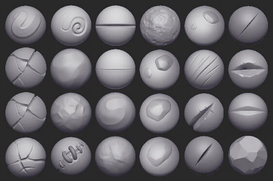
This doesn’t show where/how to access 60 different pre-configured/imported alphas+settings brushes that exist under the draw brush. 19 under clay. 33 under clay strips, 4 under layer, etc?

image image

I say that if the most highly professionally user tested solution looks like this then Blender should follow suit:


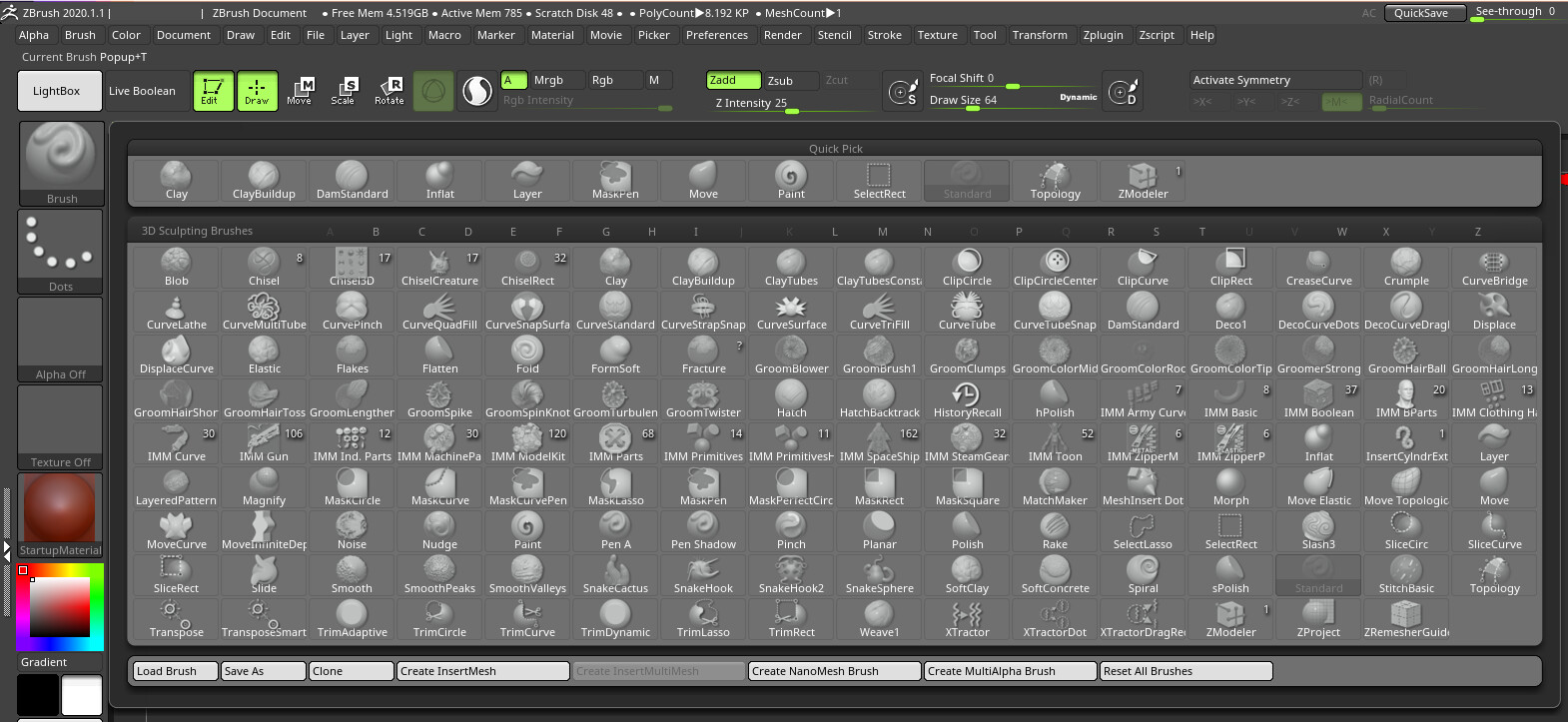
(can we all agree that the left side Brush, Stroke, Alpha, Texture, Material & Color locations are probably the absolute best place those options could ever be located?)

If the 2nd, 3rd, 4th, 5th, etc most highly user tested solutions all happen to be Blender Sculpting Brush Management Add-ons that don’t look like Zbrush, well then we should follow one of those.

The absolute worst thing they could choose is to do something entirely from scratch without consulting the people who have made successful brush management add-ons.

The most logical thing to do is

  • Ask for feedback on the most popular add-ons from professional users who have used those add-ons daily for several years.
  • Choose 1 add-on.
  • Ask that author what headaches and roadblocks they encountered when making the add-on.
  • Fix those issues in Blender.
  • Improve the add-on.
  • Get more feedback from professional sculptors
  • Reduce the feature set of the add-on so the original add-on author can still sell a premium product.
  • Adjust anything in the add-on UI that is not “blenderish”.
  • Ship the addon, already activated, within the Blender download.
  • Migrate the add-on’s code from Python to C++ over time, not for the purpose of making the functionality native, but for the purpose of letting other add-ons benefit from super fast implementations of functionality that they would probably want in their own add-ons anyway.

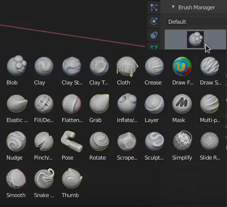
In this video at around 33 seconds you can see that it is already possible to have zbrush style beheavior as in EVERY brush in the file is listed all at once and when you choose one it automatically switches to the appropriate brush-tool needed for that brush.

Video from this addon: https://tingjoybits.gumroad.com/l/zLBPz
image

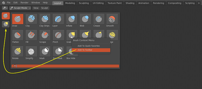
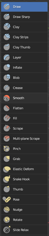
So we could get rid of all of these:

And don’t need that “Add To Toolbar” stuff:

5 Likes

Every little list UI element in Blender needs massive improvement. More work on the Asset Browser should be put on hold and Dev effort temporarily redirected to those other areas. It would result in a massive improvement to Blender itself as well as EVERY addon that already exists that makes heavy use of those lists.

7 Likes

That should work like zbrush obviously… That’s the whole point of a brush menu/palette… to have a place that you can access all your brushes at once… no more hunting and guessing where things are… that “under” thing was a terrible idea and needs to be removed…
There will be just one brush tool, everything else is gonna be a brush preset of that brush tool…

And no, brushes in the sidebar is a big no… that’s the whole point of this conversation in case you missed…

this is what Dalay designed as task a month ago and I suppose it will look like this

1 Like

8 Likes

Well obviously, that is misleading to neglect the order of magnitude of presents tools, properties and brush settings to display.
The problem, when you do that, is that draw a mock-up, that will have half of it out of screen, in reality.

He drew 7 subsections of tools for toolbar.
Currently, there are 6. More than half of screen height is taken just by “brushes” one (16 rows of buttons, not 3 ).
What is proposed is to add another one (exposed brushes) that is supposed to be as long.
That would make a two columns toolbar with more of half of it, out of screen (one third, if user zoom out to minimize buttons size).
That just proves that for a toolbar. Tabs will be inevitable.

Then, it looks like he wants to add just 1 panel to sidebar but change Brushes panel to display asset brush library.
Currently, sidebar contains 8 panels. And 1 of these contains 5 sub-panels.
Brushes Settings panel contains too much settings to be displayed with all its sub-panels open.
That sucks because those sub-panels are as important as 5 panels that are corresponding to mode options.
So, actually, a sculptor is already using sidebar + properties editor to display all settings he needs.
He already has to scroll.
Brushes panel size is doubled in mock-up.

What is supposed to solve that is the cherry-picking of brush settings.
That looks a lot like sculpt-dev branch UI ; where user can choose to display a setting in tool settings bar, sidebar or properties editor instead of having them repeated in 3 places.

I have faith in this solution. I encouraged Joe to create it in sculpt-dev branch to handle abundance of settings and mode properties.
But Joe did not organize properties tabs as I asked him to do.
He added a Brush tab, where brush settings are no more in sub-panels ; but in panels, that can be reorganized.
But he used it to configure a simplified Brush Settings panel of it in active tool properties tab.
Because he could not mess-up the whole brush as active tool UI principle.
I was wishing that simplified brush settings UI would correspond to a tab, mode options to another one and configuration of brush settings to a third one.
That way, order of brush settings panel could be ordered differently in Properties editor and Sidebar.
But, in sculpt dev branch, brush settings order is still fixed as sub-panels in sidebar.

So, I hope that they will make tabs to configure UI, differently than in sculpt-dev branch.
I hope defaults will be chosen wisely.

But the intention, behind cherry-picking idea, was not to free space to display a brush library.
A brush library added to sidebar will not double the size of Brushes panel.
It will quadruple, quintuple it and take again, more than half of screen height.
That can not be handled just by cherry-picking of settings.

Tabs in sidebar have to be more numerous to handle sculpt mode.

According to the devtalk thread, the plan for the new brush UI is not completely set in stone yet.

On another note, it seems sculpt mode discussion on BA will become even less useful than before if there is now jumping to conclusions combined with speaking in meme (which the latter I find to be a rather low-brow way of discussing things).

I think that sculpt mode should be a extension of geometry nodes personally,

as it’s all just geometry and brushes are pretty much node setups if you know your math.

we can leave a curve when we sculpt → adjust it and have it both color and sculpt the mesh*

I already gave up in anything Sculpt UI related, but fingers crossed it’ll make me use it again instead of fixing everything with “Pie Menu Editor” addon.

3 Likes

I just read about this independent pie menu tool:

https://twitter.com/floreum/status/1564783755440824321?s=21&t=vgNSVUWYdRDLoYl57DlKLg

I’ve opened a separate thread for the tool if you’d like to discuss it:

9 Likes

C’mon, I mean, c’mon…

7 Likes

So, to the user they would see brush settings, and it would behave like a brush,

(the brush settings exposed would be like the the properties exposed to geometry node inputs but instead by sliders, dials , normal vector input boxes etc.)

but you could check the ‘source’ of the brush and it’s nodes*

when we sculpt we are creating a curve basically
this curve (if more than 1 point) can be used to define UV space*

we can sample also using math to do the stroke (distance from curve, curve normal, surface normal etc)

we would need a pbvhtree enhanced proximity node and attribute transfer node*

this holds truest to ‘everything nodes’

I couldn’t have put it better myself.

2 Likes

the way it is now you can’t create and share new brushes*

*this would also allow sculpting and passing attributes like color / uv’s / custom normal from the stroke

most people would never touch the node interface to sculpt, only to make new brushes*

For reference, every design proposal BPR makes is framed by his work in UPBGE and essentially turning Blender into a BGE game (which is the reason for other proposals like replacing the UI with a hack making use of overlay scenes powered by Python).

In particular, completely reworking a feature so it can go into Wrectified (his UPBGE project).

3 Likes

well is not that bad to have some humor and sarcasm about little silly things about blender, zeebee or related softs…

2 Likes

So - back to the topic *

I have discovered some math that appears to get uv space relative to a curve*

p1 = closest_point_on_stroke_to_pixel_or_vertex
n1 = normal_at_point_on_stroke
i = curve_point_index/max_curve_point_index
p2 = the_pixel/vert_in_question_world_position
n2 = p1-p2.normalized()

U = i
v = (p1-p2).length
if n1.dot(n2)<0:
    v*= -1

for strokes longer than 1 point*

one considers the sculpt path a curve we can apply UV textures along the curve - both as textures and we can displace the surface / sculpt with it too*

on the topic

1 Like

I wonder if you ever have read this and actually followed your own advice. I can’t tell how many times I’ve seen you digress anything Blender development related to the totally unrelated Blender Game Engine and your game project.

1 Like

(continuing on the topic)
From a development standpoint * and considering everything nodes proposal and long term upkeep,
the more systems share the same pieces where they are relevant the better*

using unified architecture is wise for reducing intellectual debt and a bunch of other reasons.

from a sculpting point of view nothing would change
(instead there would be a new node editor ‘brush’)

people could make new behaviors using math / share them on blendswap or in .blend files or nodegroups.

You should share your thoughts here (•) blender.chat or here (•) blender.chat

2 Likes