Thinsoldier's Sketchbook 2024

Other Sketchbooks

2020-2021
2022
2023
2024


post thumbnail

51


48
46


Random Links

manage all youtube history
manage youtube comments
http://thinsoldier.com/music/
Cycles Development Updates
Developer Meeting Notes
EEVEE Development updates ( EEVEE-Next )
https://www.color-blindness.com/color-name-hue/
https://github.com/BenjaminSauder/EdgeFlow/releases


6 Likes


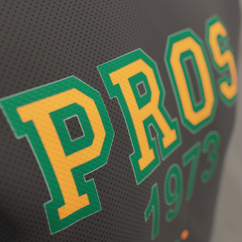
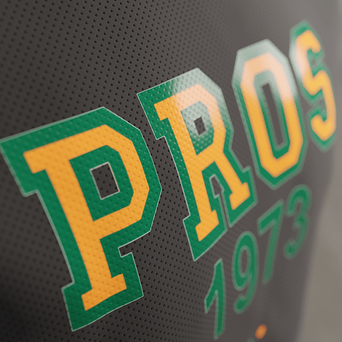
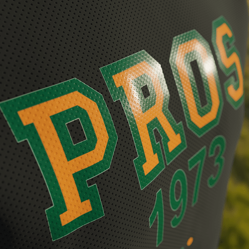
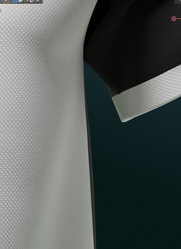
Downloads\3D Downloads\Sketchfab Downloads\tshirt by tabbuso\source

5 Likes

Looking good, excited to see what you come up with this year!

2 Likes

They’ve got to do something about this bump node crap.

Bump node is giving me a razor sharp reflection even though the roughness is maxed out and usually a rough enough bump map gives a similar look of roughness to 0.5 or higher even if the roughness was actually set near zero.

3 Likes

3 Likes

Nice experiments with jersey’s!

1 Like

I swear this looked fine in AGX back when AGX was still experimental.


2 Likes

Q

A


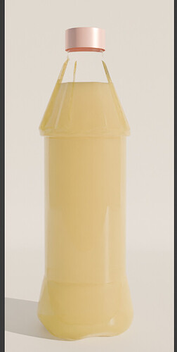
I think this one is either just subsurface shader or principled with full subsurface and a little bit of transmission.

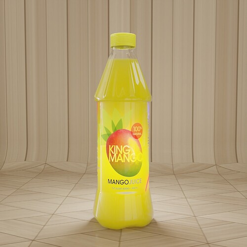
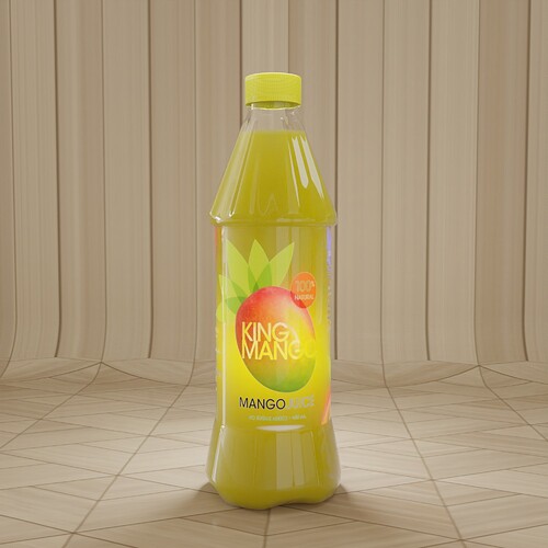
\2022\a****y fruit drink\material testing 27418 v3

https://www.blendswap.com/blend/27418

3 Likes

what thread is this answer from? I’m interested.

image

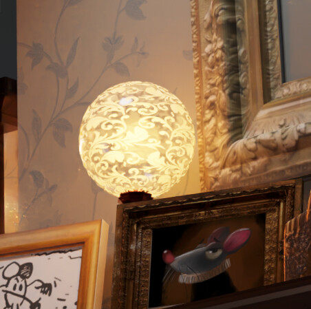
lamp above the fireplace in Mr. Elephant cycles version

\Downloads\blender demo files\mr_elephant\


5 Likes

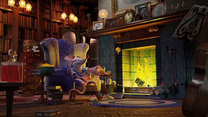
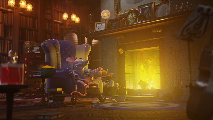
Love the renders with big bloom! Gives it a great feel!

1 Like

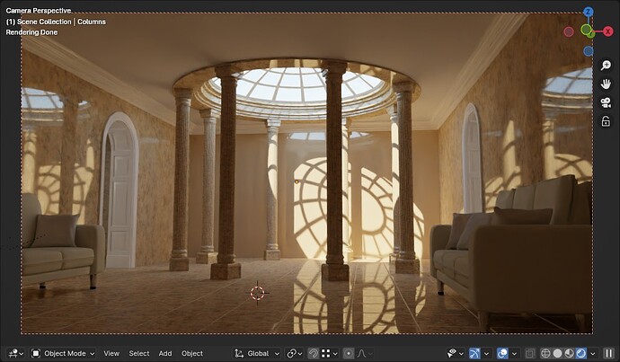
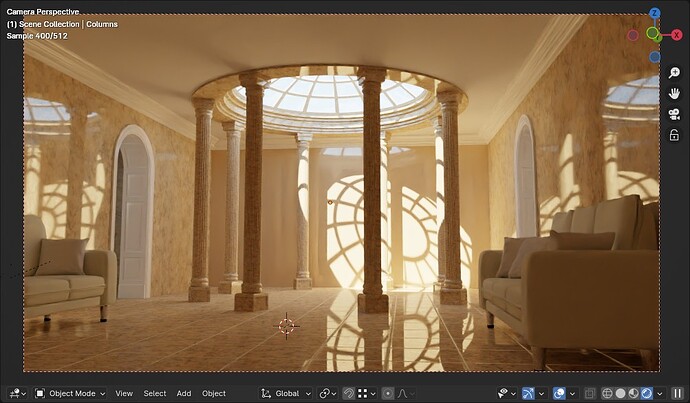
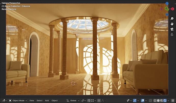
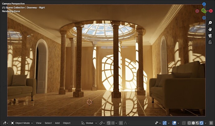
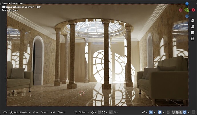
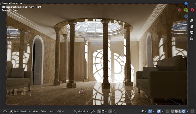
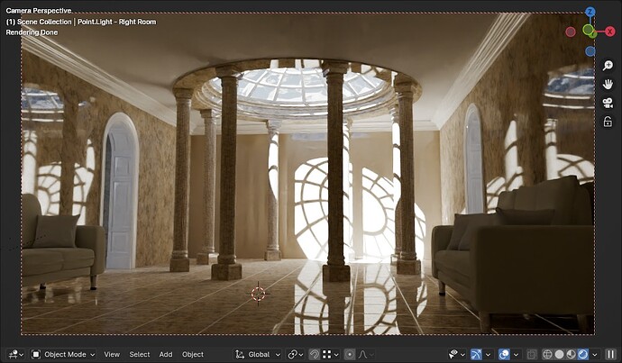
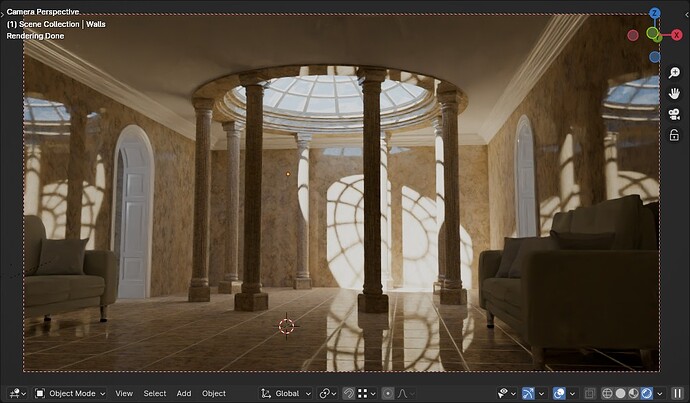
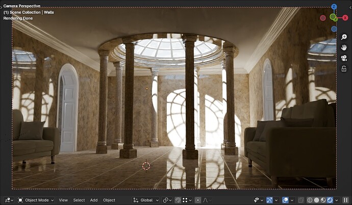
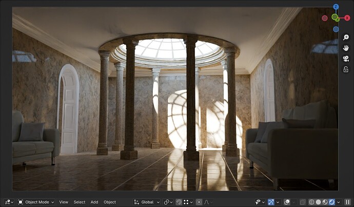
Downloads\3D Downloads\Blendswap Downloads\_scenes\the-music-room 13775\tests


3 Likes

Nice job experimenting with the lighting, I prefer the shinier floor shots personally.

1 Like

playemulator.io classic NES tetris

NES styled USB controller

USB to USB extension cable

joy2key app set to game default keys


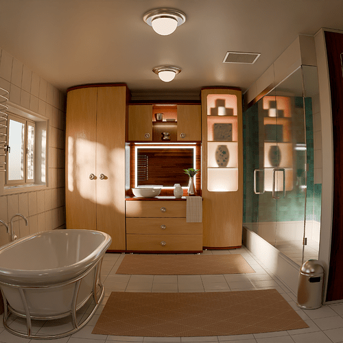
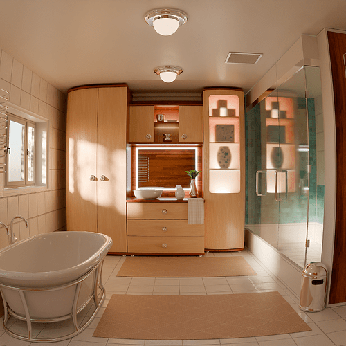
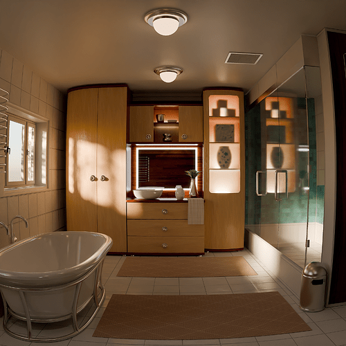
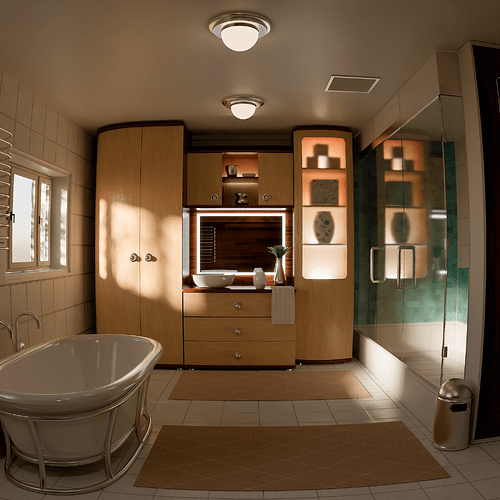
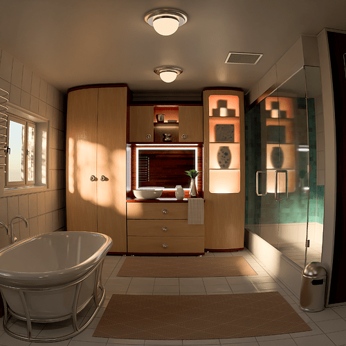
~\Downloads\3D Downloads\Blendswap Downloads\2023-06-21\bath 18595 ndakasha\

5 Likes

Hi. Could you try this contrast look in your image?

Add it to the OCIO config

 - !<Look>
    name: Test New Contrast
    process_space: AgX Log
    description: Contrast look similar to tcamv2 base contrast (only values no color)
    transform: !<GroupTransform>
      children:
        - !<GradingToneTransform>
         blacks: {rgb: [0.15, 0.15, 0.15], master: 0.24, start: 0.19, width: 0.17}
         shadows: {rgb: [0.6, 0.6, 0.6], master: 0.9, start: 0.4, pivot: 0.05}
         midtones: {rgb: [0.6, 0.6, 0.6], master: 0.403, center: 0.2, width: 0.02}

If you think the saturation has increased, add this:

colorblind-ish. better for you to determine

https://drive.google.com/drive/folders/1ZkWCI1c77p6O1PA6aR29kduGjRHnxymC?usp=sharing

bath 18595 ndakasha (still uploading)


7 Likes

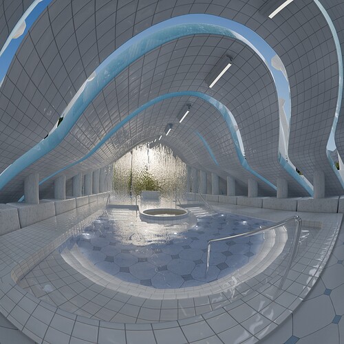
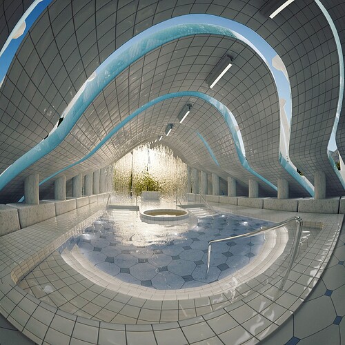
Sorry for the delay, I tried to render the scene but it takes forever and blender crashes when doing denoising. What I did is use image r11 with AgX as input colorspace and the view transform at the end was AgX with the new contrast look:

-r11 AgX / new contrast look


A C E S 2.0 and TCAMV2 as a comparison reference:


By the way, I completely redid the look because I found that it created artifacts in areas like glare edges, fixed it would look like this:

  - !<Look>
    name: New Contrast
    process_space: AgX Log
    description: punchy look that emule DRT contrast.
    transform: !<GroupTransform>
      children:
        - !<GradingToneTransform>
         blacks: {rgb: [0.3, 0.3, 0.3], master: 0.24, start: 0.18, width: 0.22}
         shadows: {rgb: [0.4, 0.4, 0.4], master: 0.81, start: 0.38, pivot: 0.05}
         midtones: {rgb: [0.6, 0.6, 0.6], master: 0.406, center: 0.2, width: 0.015}

And now there is also LDR, a punchy look that allows you to have less dynamic range, in case you want brighter highlights (it would be something like high contrast that only affects the high ranges):

  - !<Look>
    name: LDR (Low Dynamic Range)
    process_space: AgX Log
    description: Contrast look similar to tcamv2 base contrast (only values no color)
    transform: !<GroupTransform>
      children:
        - !<GradingToneTransform>
         blacks: {rgb: [0.3, 0.3, 0.3], master: 0.24, start: 0.18, width: 0.22}
         shadows: {rgb: [0.4, 0.4, 0.4], master: 0.81, start: 0.38, pivot: 0.05}
         midtones: {rgb: [0.6, 0.6, 0.6], master: 0.406, center: 0.2, width: 0.015}
         highlights: {rgb: [1.6, 1.6, 1.6], master: 0.29, start: 0.4, pivot: 0.43}
         whites: {rgb: [1.9, 1.9, 1.9], master: 0.7, start: 0.4, width: 0.3}
3 Likes