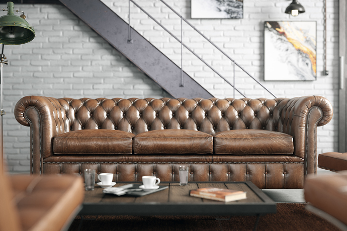
Industrial Loft with vintage furniture

This is my latest project. I’ve already talked about my intention to create an industrial loft in order to include some old, vintage furniture, created with Blender and textured in Substance Painter, in this thread.
Finally, after some experimenting and searching through various images as a reference, I came up with a basic idea about what I wanted to present. And this is the result…

I owe a great deal of gratitude to my good friend (and, I would dare to say, my tutor also) @SunBurn, who is always willing to help and share his great knowledge on architectural composition, light behaviour and on all kinds of blender stuff, and from whom I received great pieces of advice throughout the whole project’s progress. I would also like to thank my friend Jason Raptopoulos, who is a photography guru and a very talented and upcoming 3d artist for his help too.

About the scene now. Most of the furniture and assets were modeled and textured by me, except for some secondary ones, like the floor light, the wall lights, the coffee disk, the flowers, the carpet and the books, which are free models downloaded from 3dsky.org.

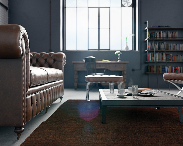
I’m preparing some close-ups with dof, in order to present more detailed views of the furniture.

As I’ve already mentioned in older threads, I’m a 3d hobbyist, but nevertheless, I seek personal improvement through the process of creating models and compositing scenes, and of course my main goal is always to achieve an aesthetically pleasant result in my work. I hope you like it. As always, comments and constructive criticism are more than welcome.

PS The scene was rendered at a 3000x2400px resolution, with 3000 samples and denoising. I used hybrid rendering (5960X @ 4.0GHz + gtx 1070 8gb) with a tile size of 16x16 (I thank @SunBurn for this). Render time was ~5h 45m and the scenes peak memory usage during rendering was over 12gb (system’s memory was @ 20gb in total).
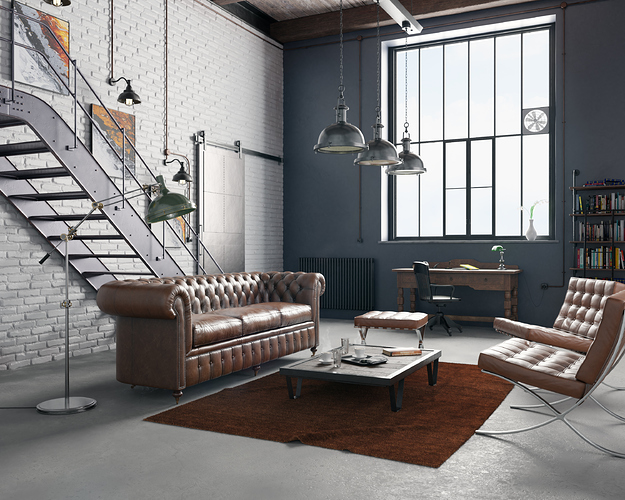
67 Likes

that looks really amazing !!!

2 Likes

Thank you very much!

2 Likes

Another camera angle with dof.

13 Likes

wow! Great scene! I would love to see more of that scene!

2 Likes

Thank you!

1 Like

And a third view with a focus on the chesterfield sofa.

12 Likes

You’re #featured!

1 Like

Thank you for the honour!

1 Like

Nicely Done – IM getting ready to do some furniture and will be looking back at your thread to borrow some techniques

TIM

1 Like

what’s behind that huge iron door? :slight_smile:

Awesome! It looks so good at first glance I thought it was a photo (I saw it posted on the BA Facebook page first).

The lighting looks fantastic, as well as the materials and modelling. Can’t fault any of that. The only thing I can see that isn’t perfect in my opinion is the floor texture. It is a little perfect for what I would expect from this sort of building.

1 Like

Fantastic Work!
I must admit I’m in love with the last image.
Keep up the great work!

1 Like

Really amazing work! Captures the atmospheer of the scene really well. Also loving the architectural composition of cold post-industrial loft with warmth provided by the brown furniture set!

The only thing that seems slightly odd is the floor - concrete i am guessing, usually it has a bit more color variation.

1 Like

@Taholmes160 Thank you.

@SunBurn Thank you for all the help and the invaluable advices. No need to say more…

@smilebags and @dimitarsp. Thank you both for your kind words! You may be right about the floor, but it has been the subject of a very tough debate between me and some friends about how it should look like. It’s supposed to be a semi-polished concrete industrial type floor, which, in order to be repaired, needs some material additions in various spots of greater damage. So, I figured that I had to produce a semi-glossy (with roughness variations) material with a concrete texture base and some color variations with a more persistent grayish material. And as a recently renewed floor, the bump should probably be very modest. It seems that it wasn’t so convincing after all, and I really appreciate your hawk-eyed observation on this detail.

@TripTilt Well, it could be anything, from a back door entrance to a what used to be an old warehouse, to a door passage to a secondary room. If you think that the door is misplaced where it stands, or that there’s something else wrong about it in general, please point it out, and I’ll be happy to read your thoughts.

Thank you.

Wow, this is great! The details are also fantastic.

1 Like

Thank you!

Nice scene!

Somehow i think the lights hanging much lower, perhaps 1m above table or less would make more sense.

1 Like

Thanks.
The table is an industrial one from the mid 20th century. Here’s a reference https://www.pamono.com/french-vintage-industrial-coffee-table-1930s-1
These tables are 20-30cm high. The ceiling lights are around 1.70m high. Putting them even lower (at 1.30m as you suggest) would be inappropriate imo.